


Trend Colours 2025: A Breath of Fresh Air for Your Home
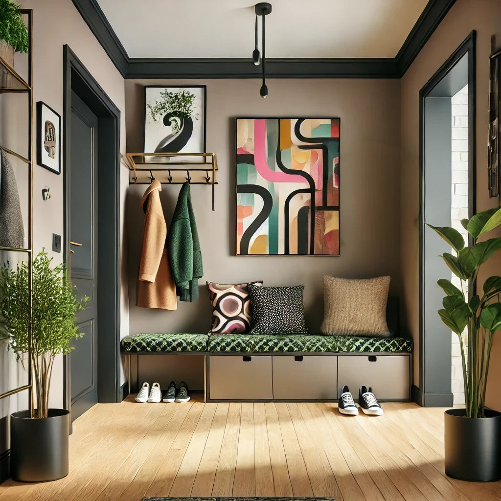
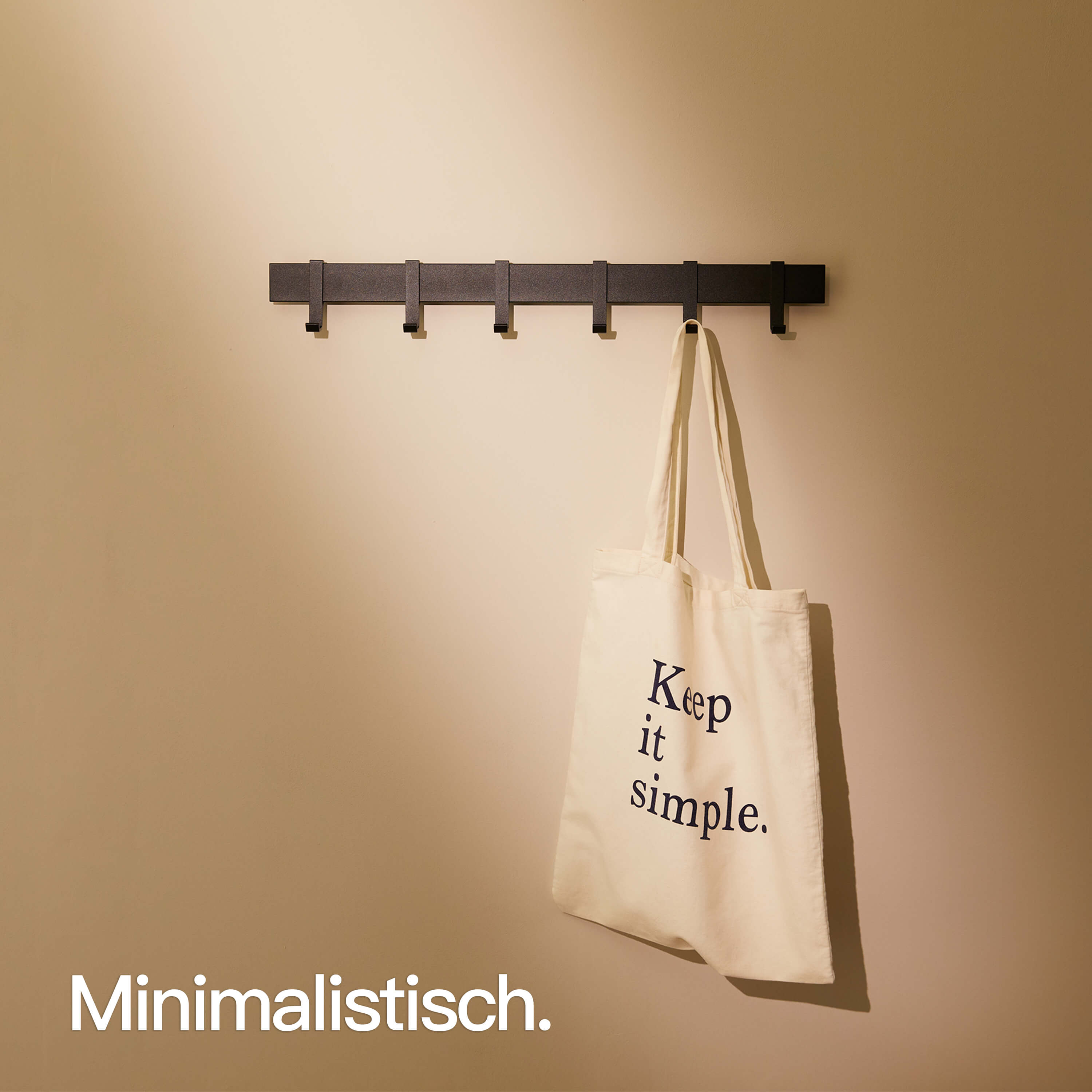
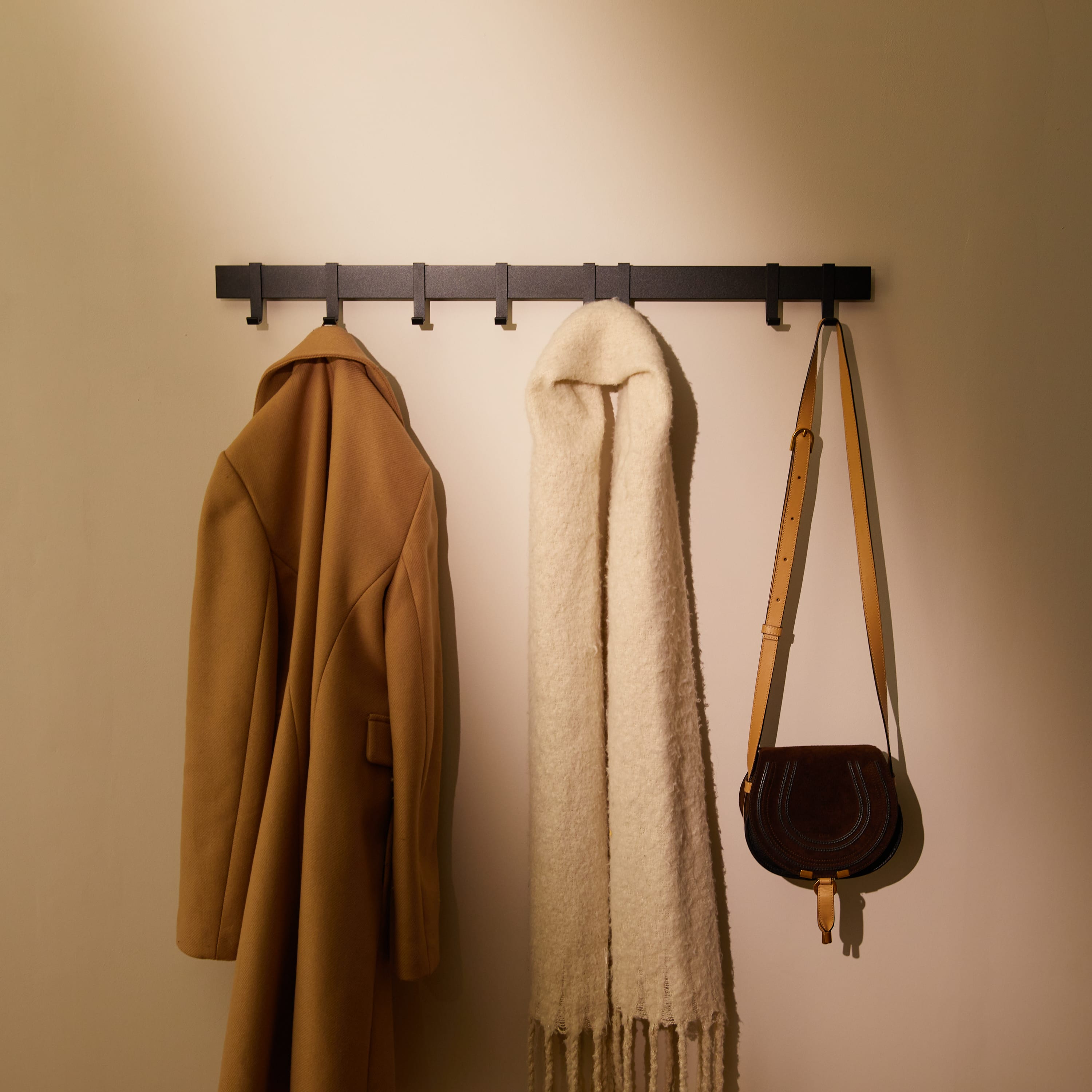
Natural elegance with earth tones
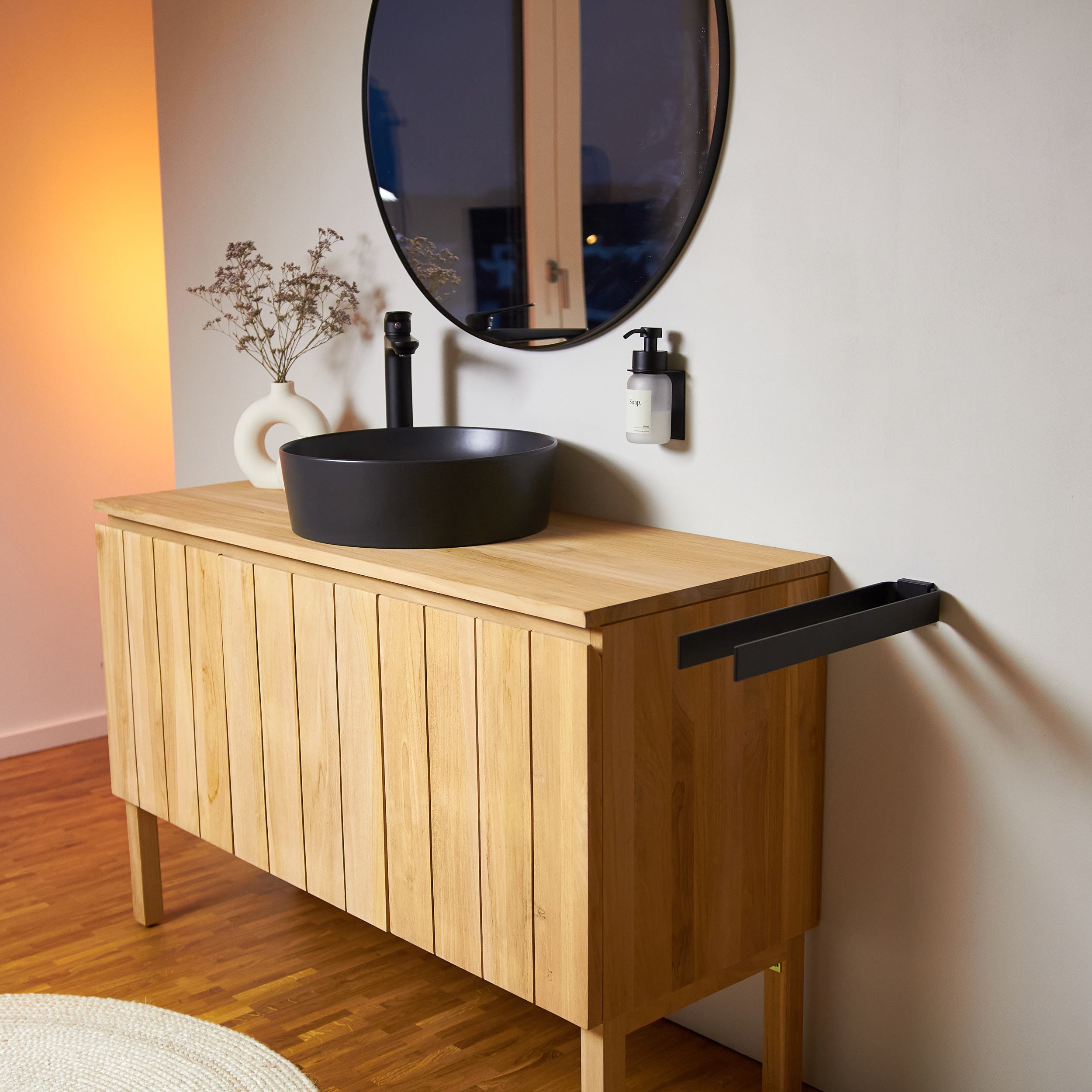
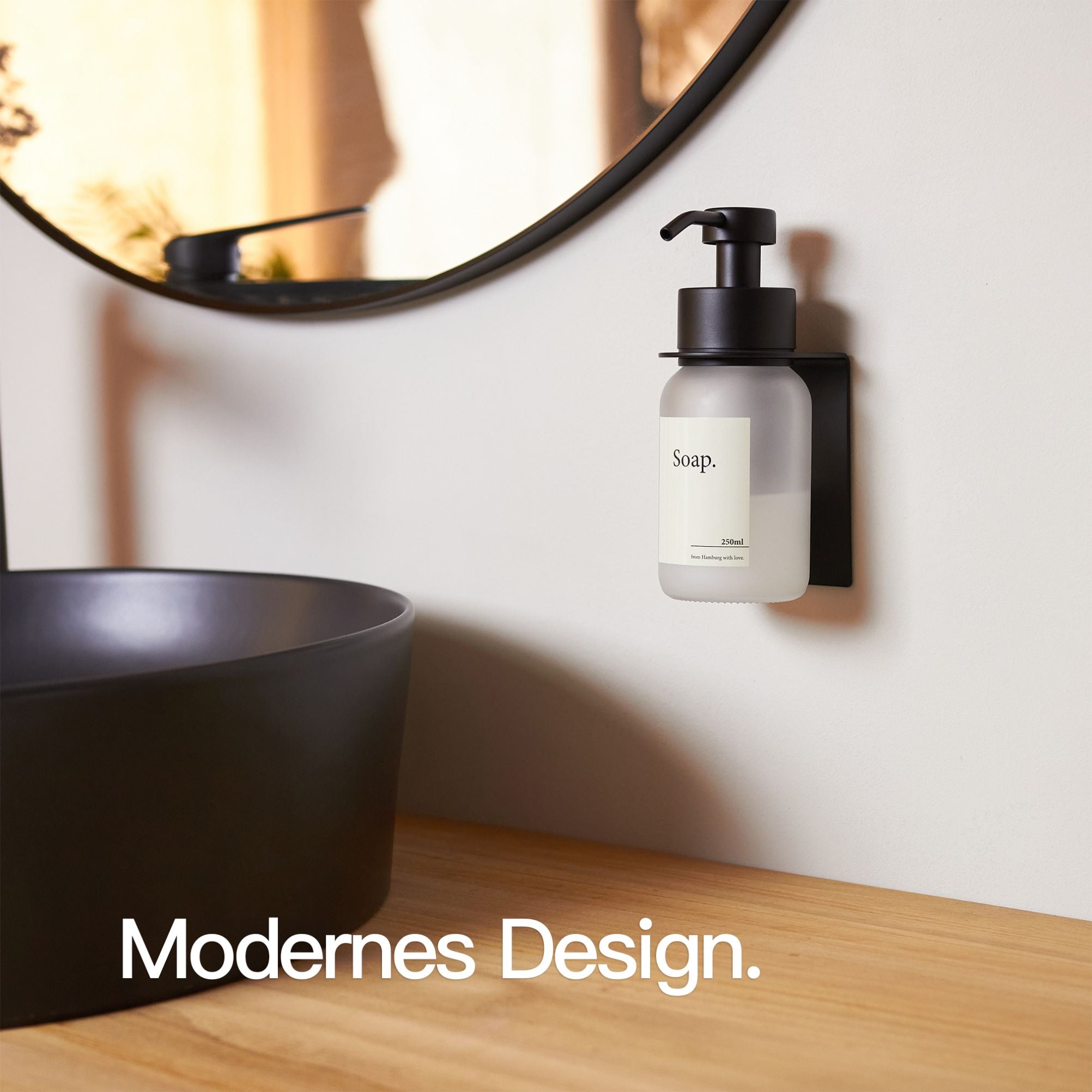
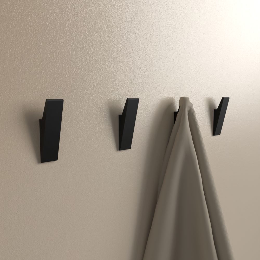
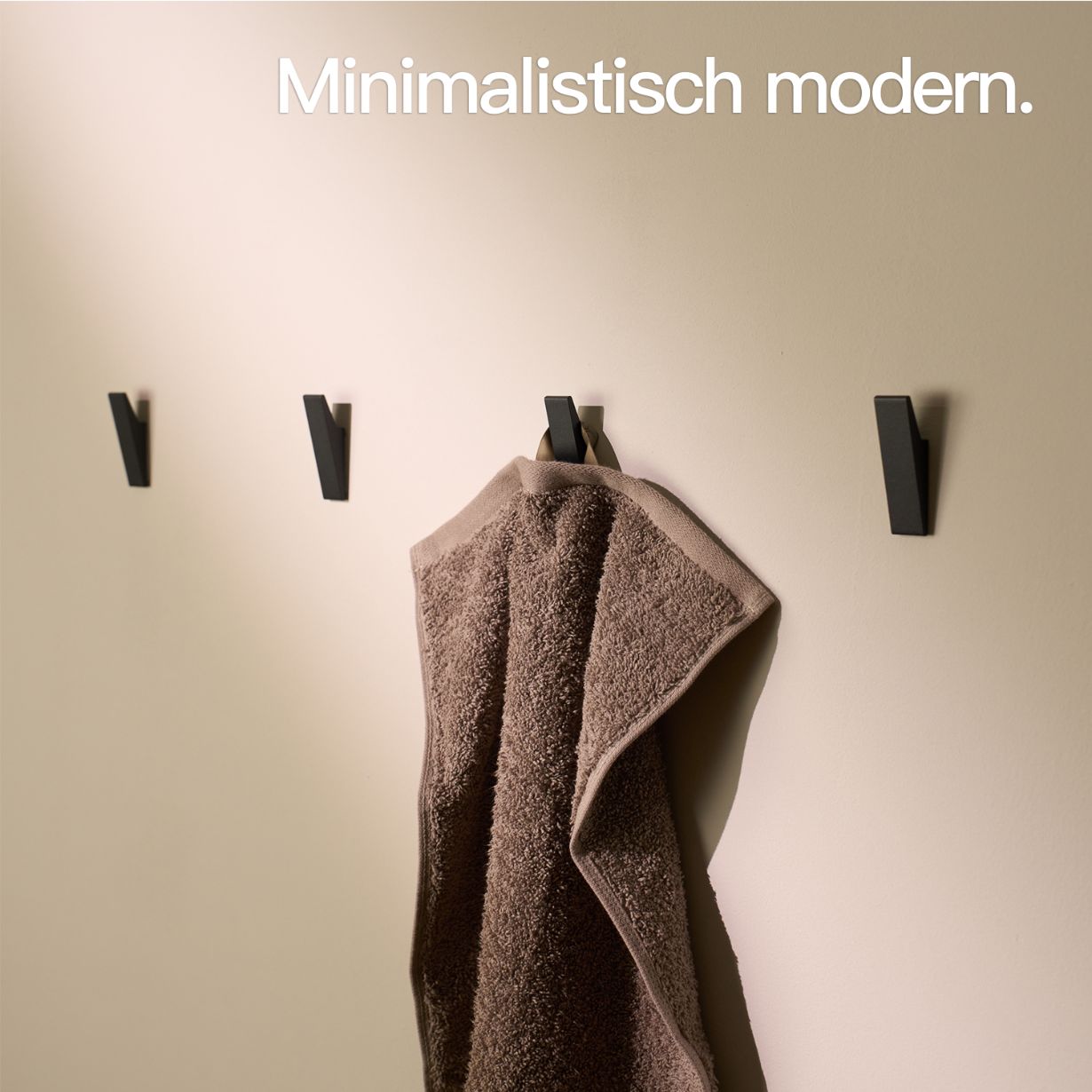
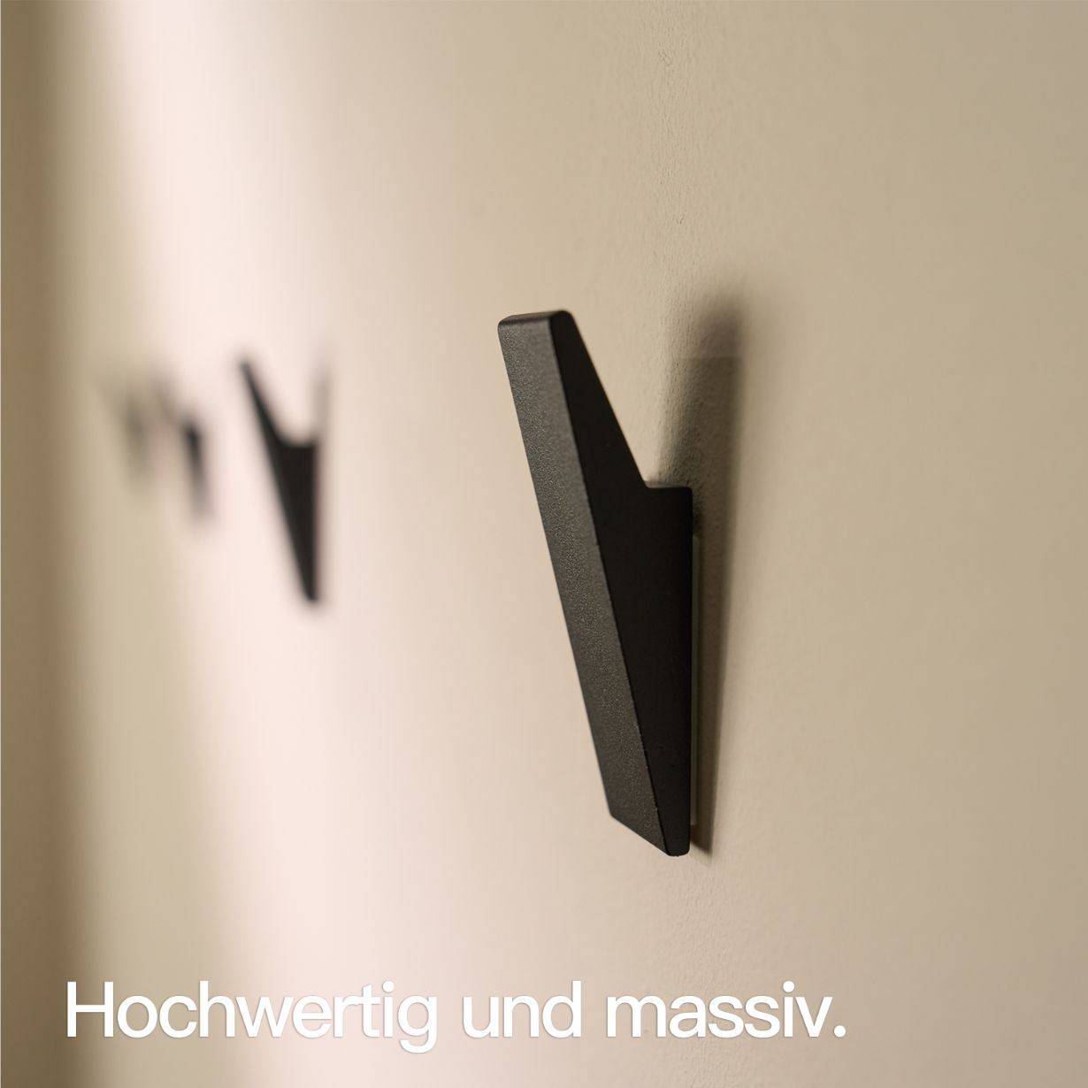
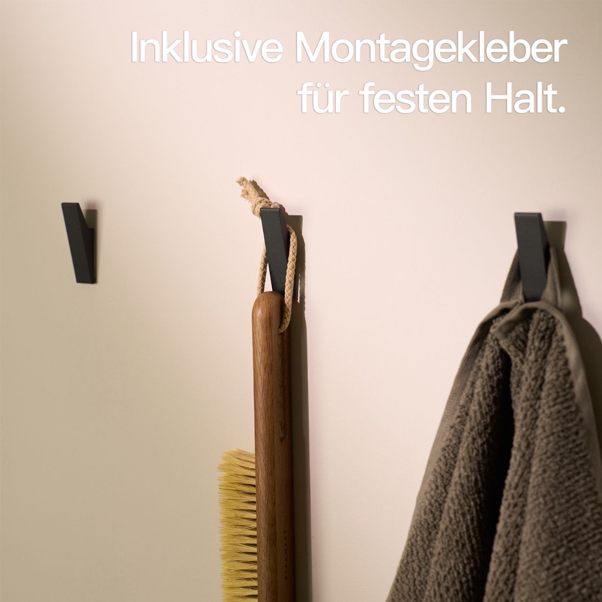
Contrasts in Black and White
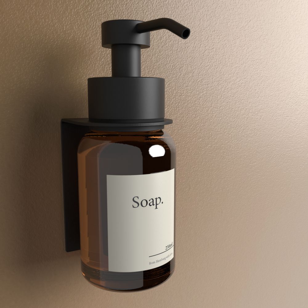
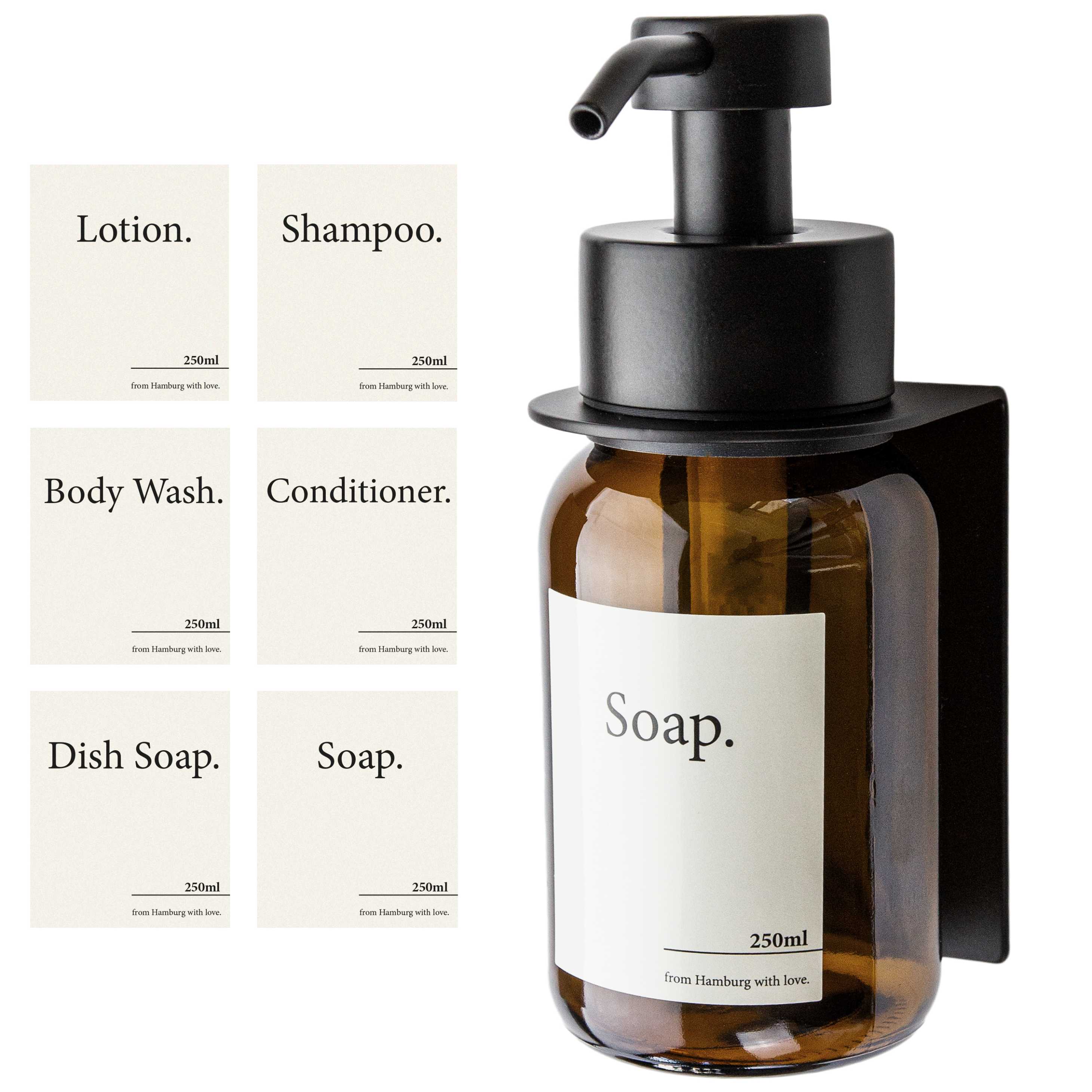
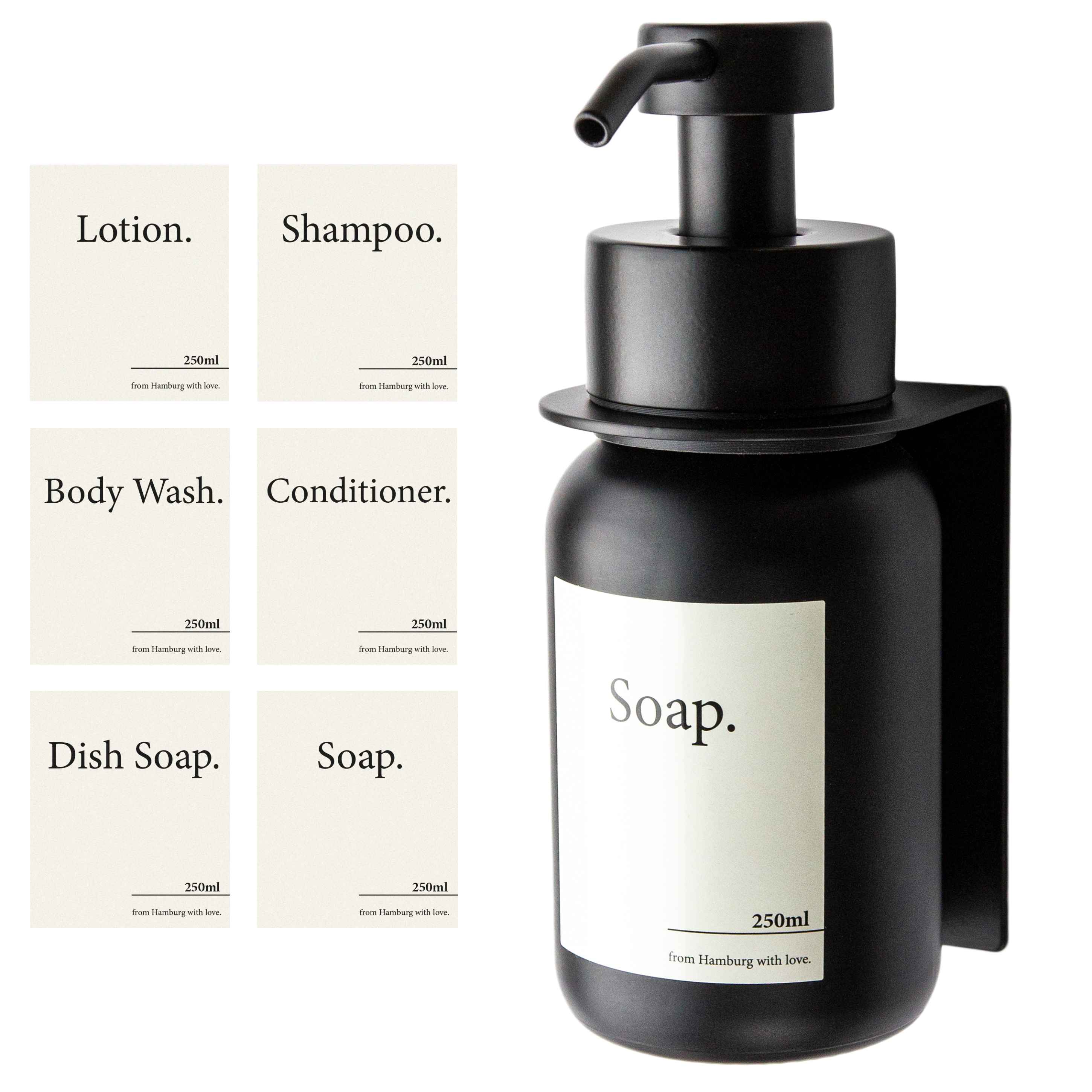
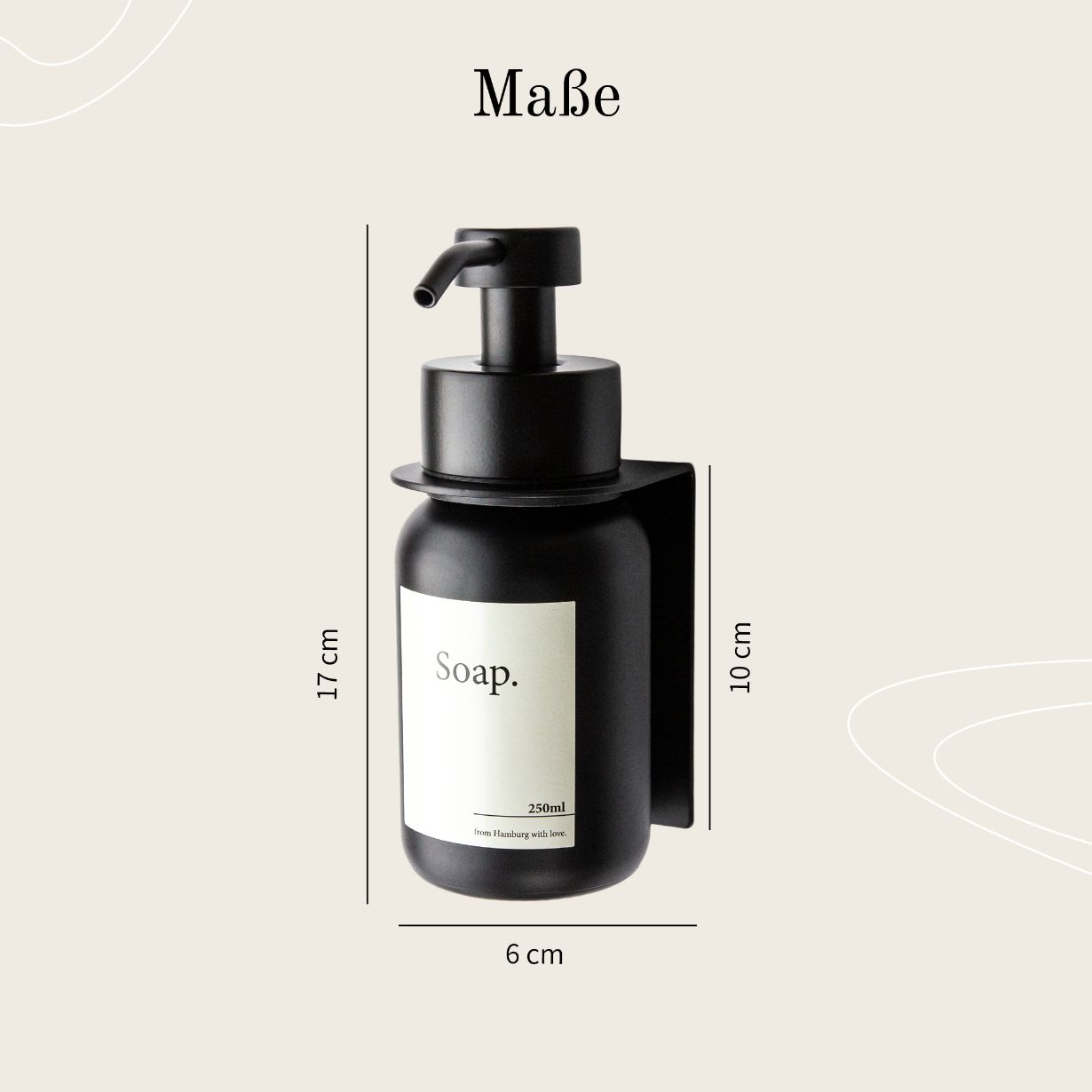
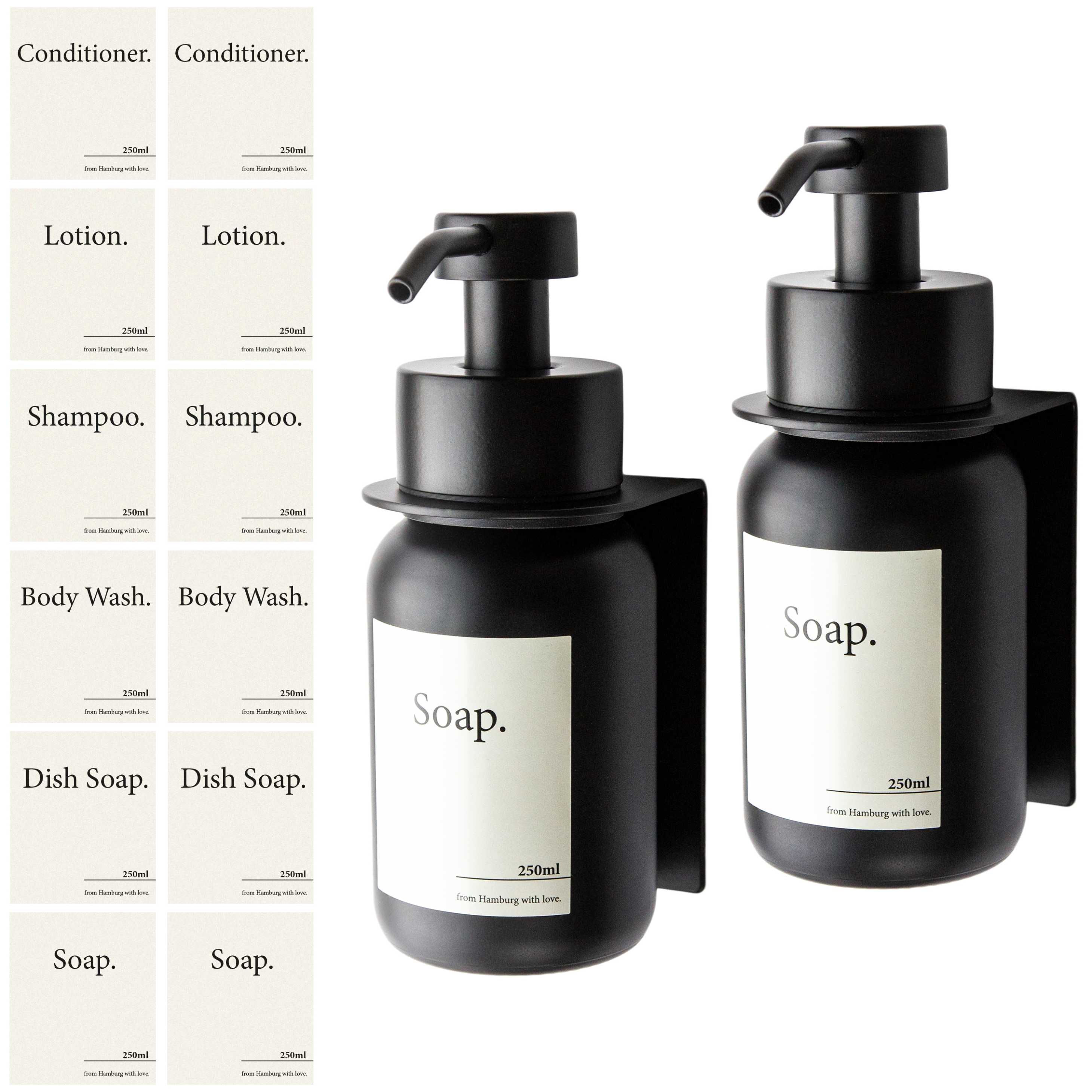
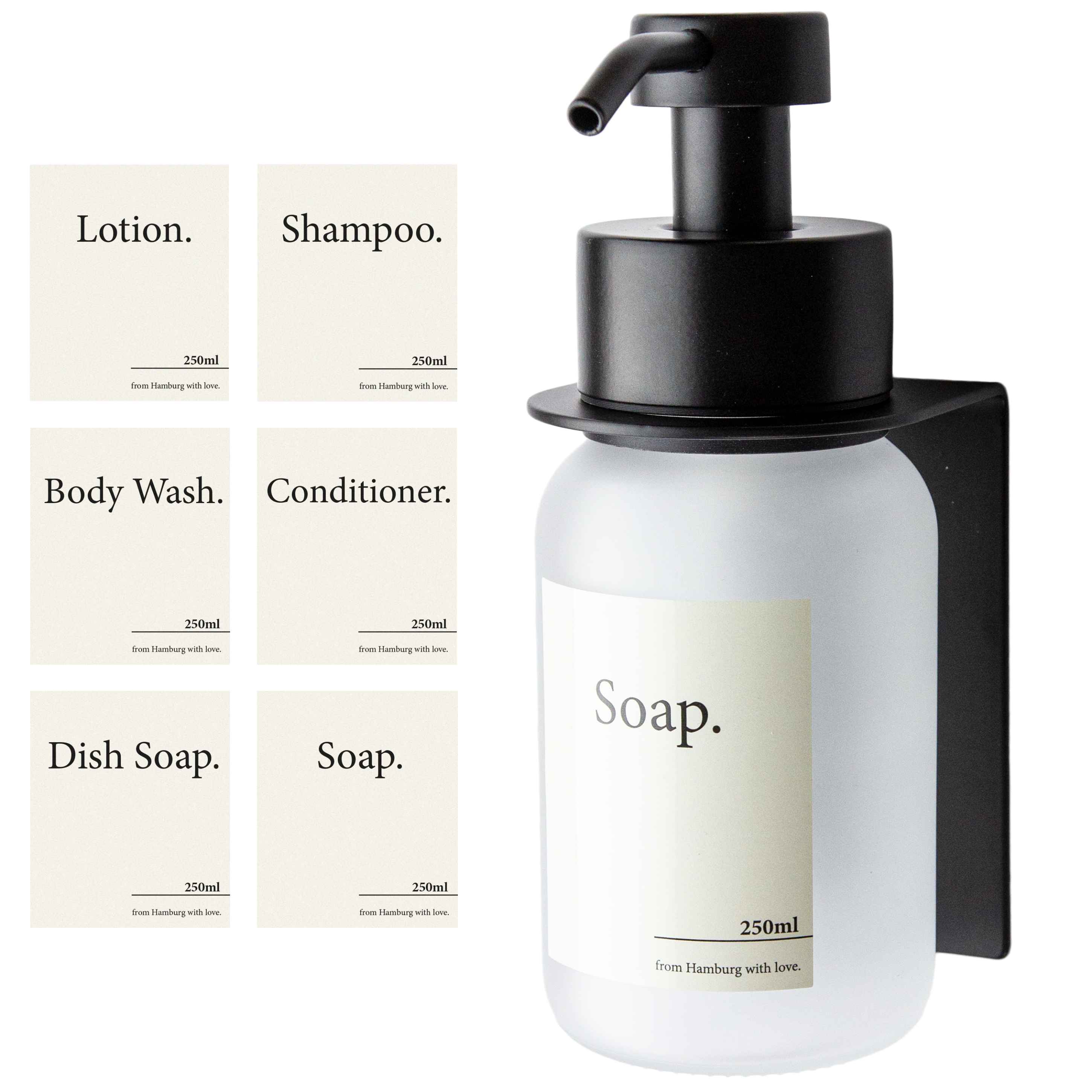
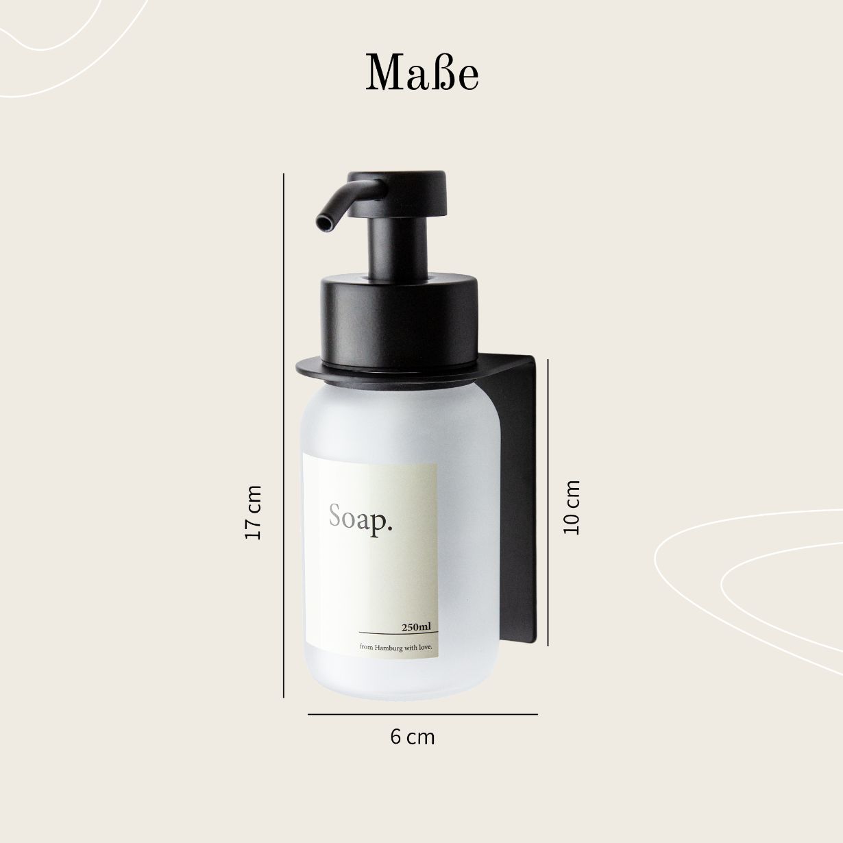
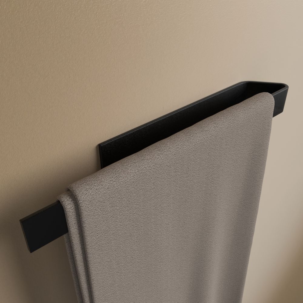
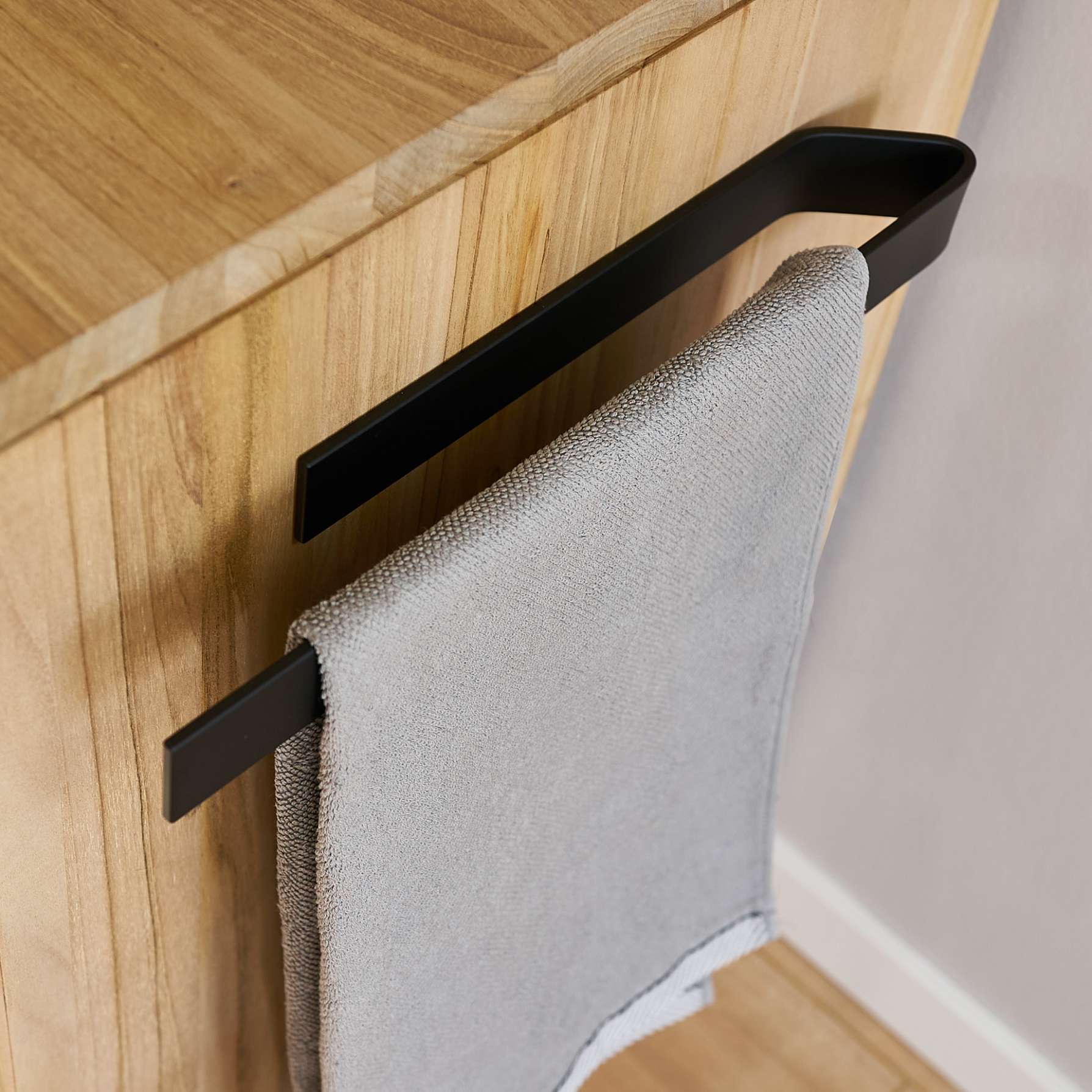
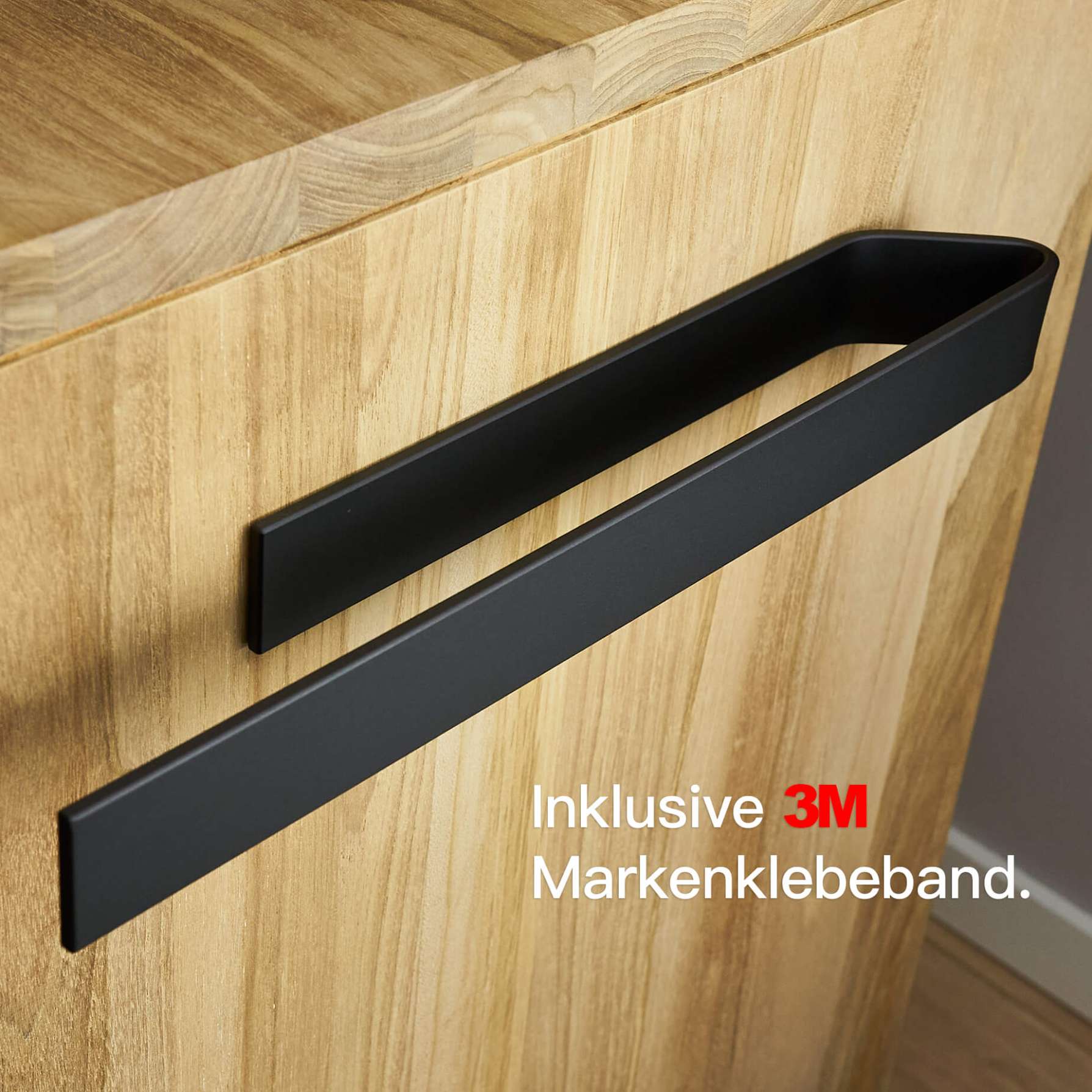
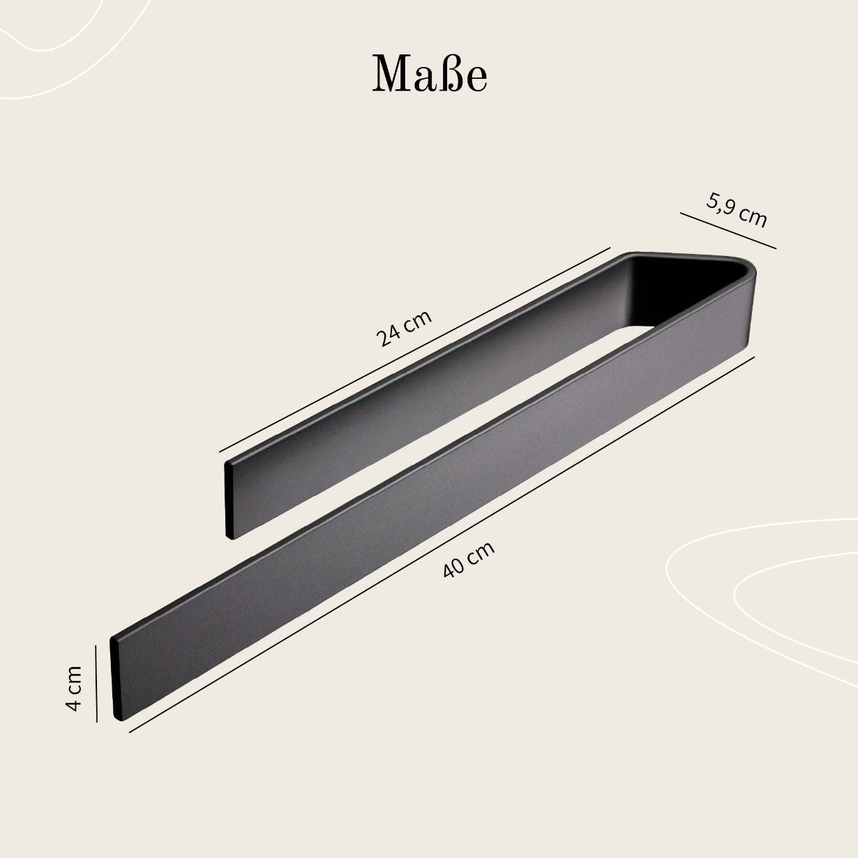
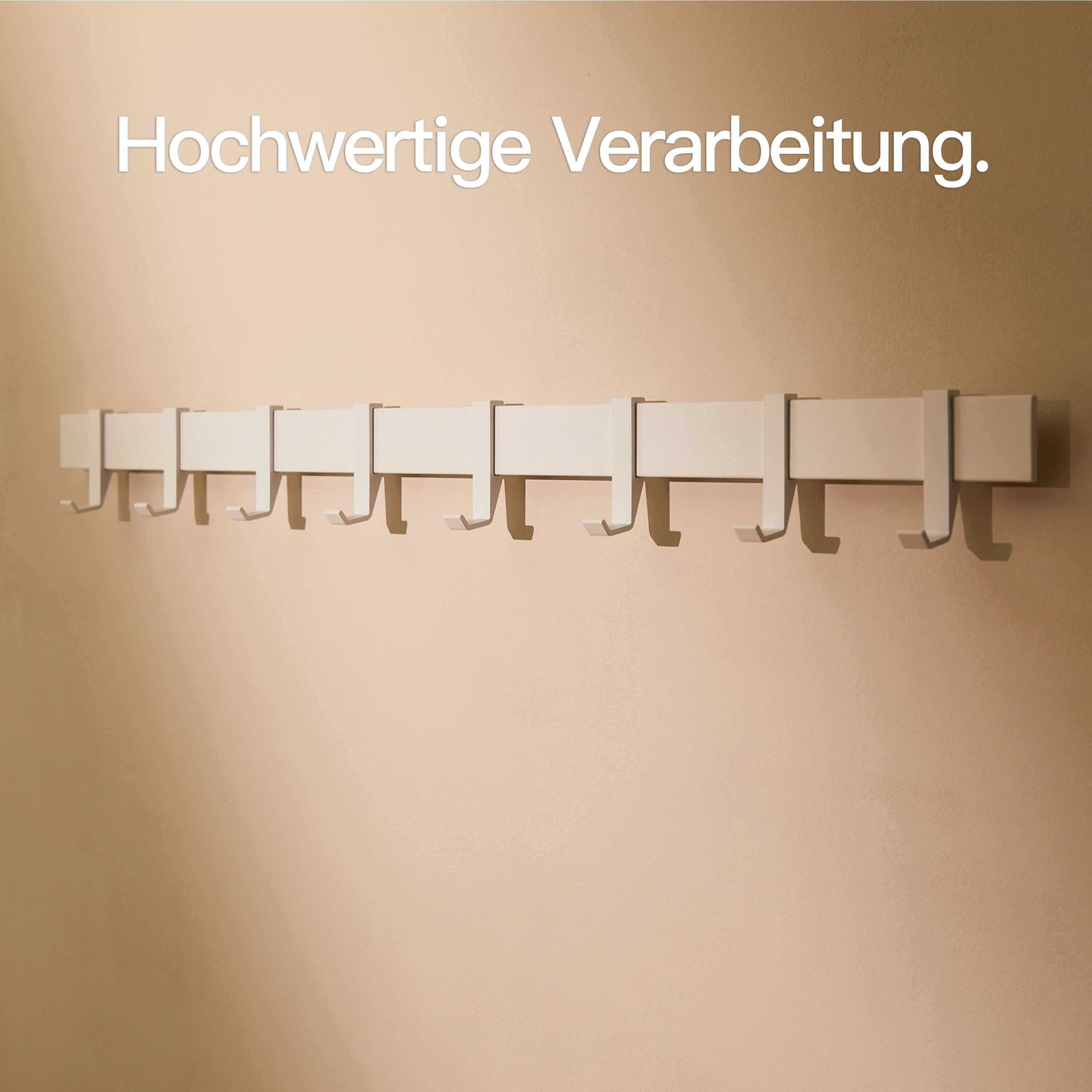
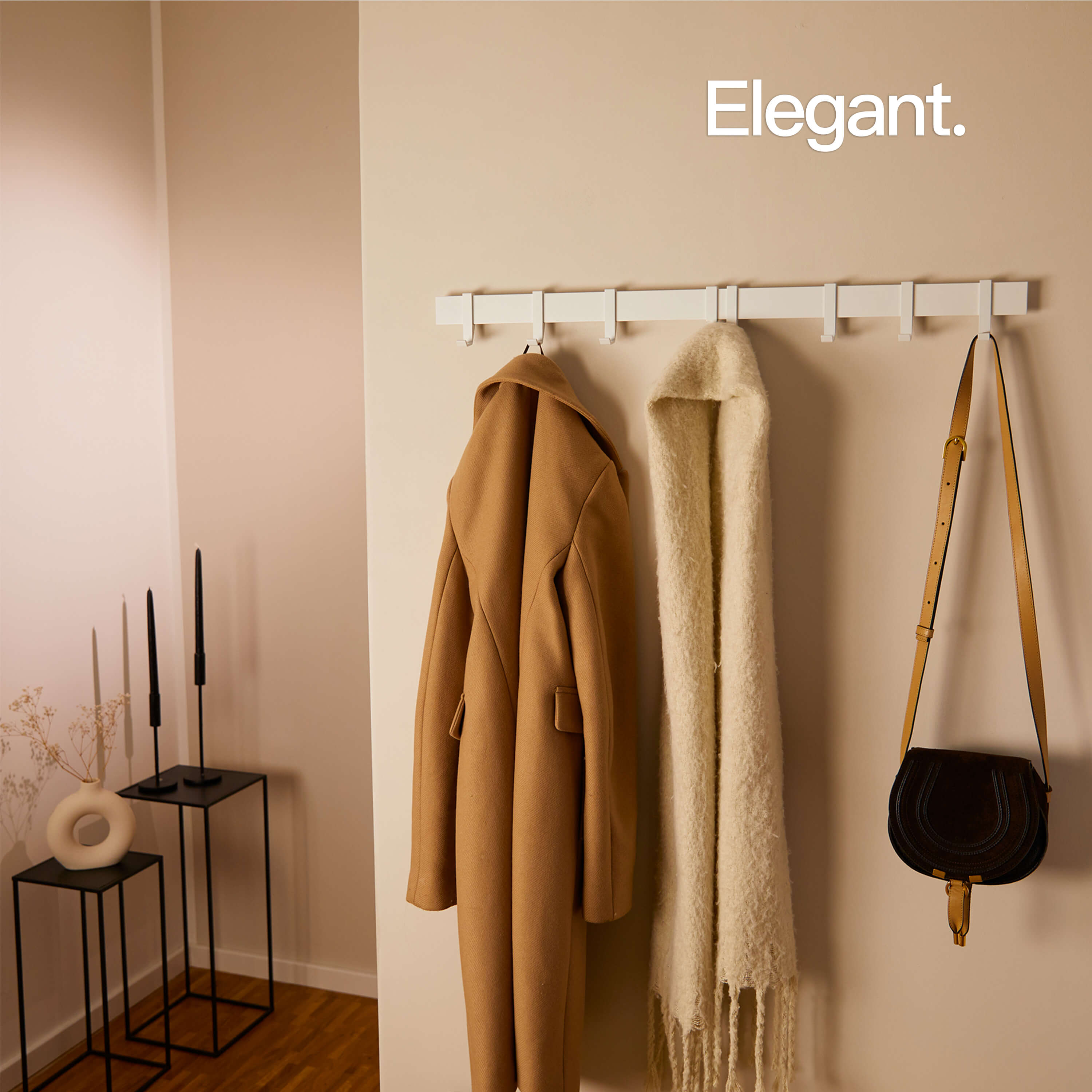
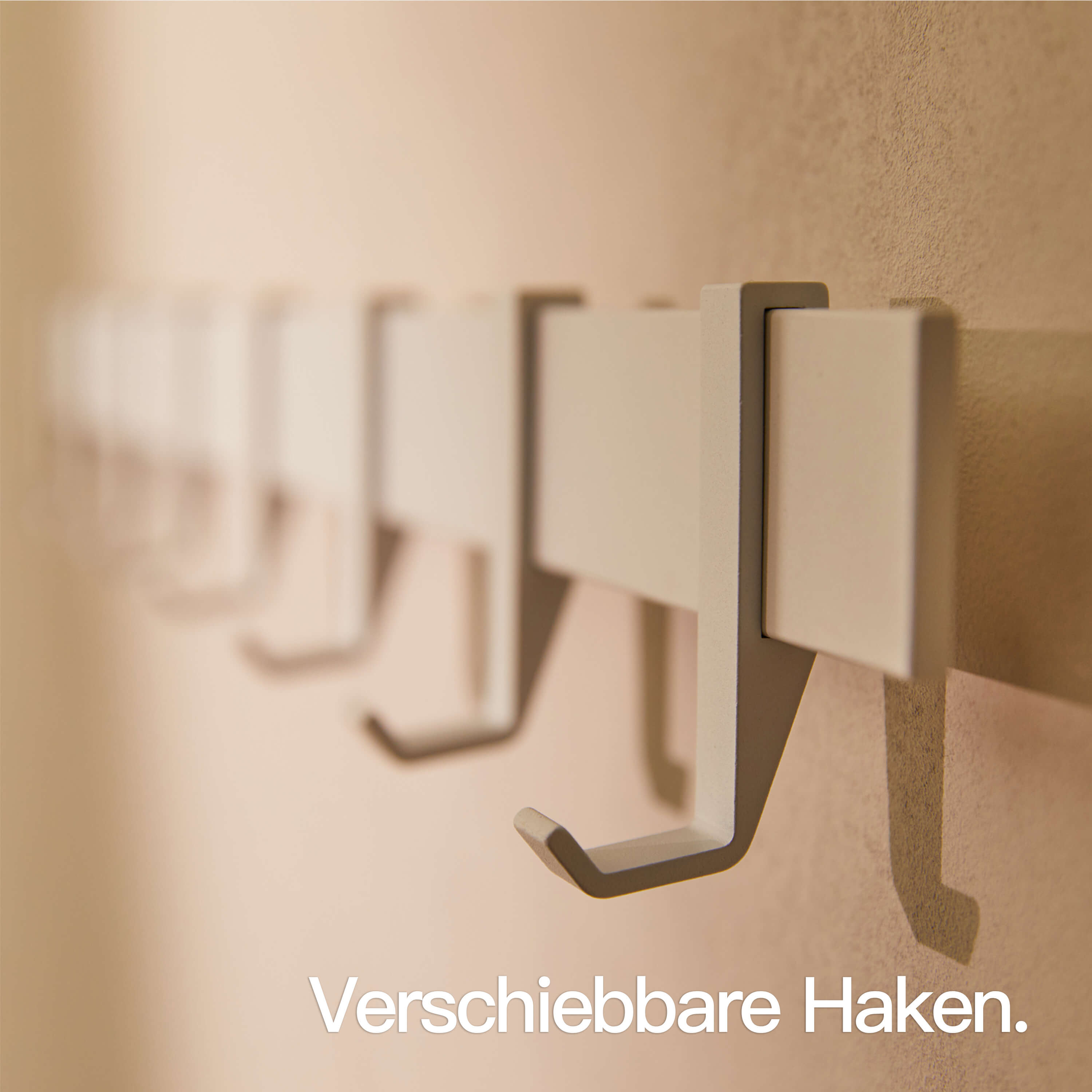
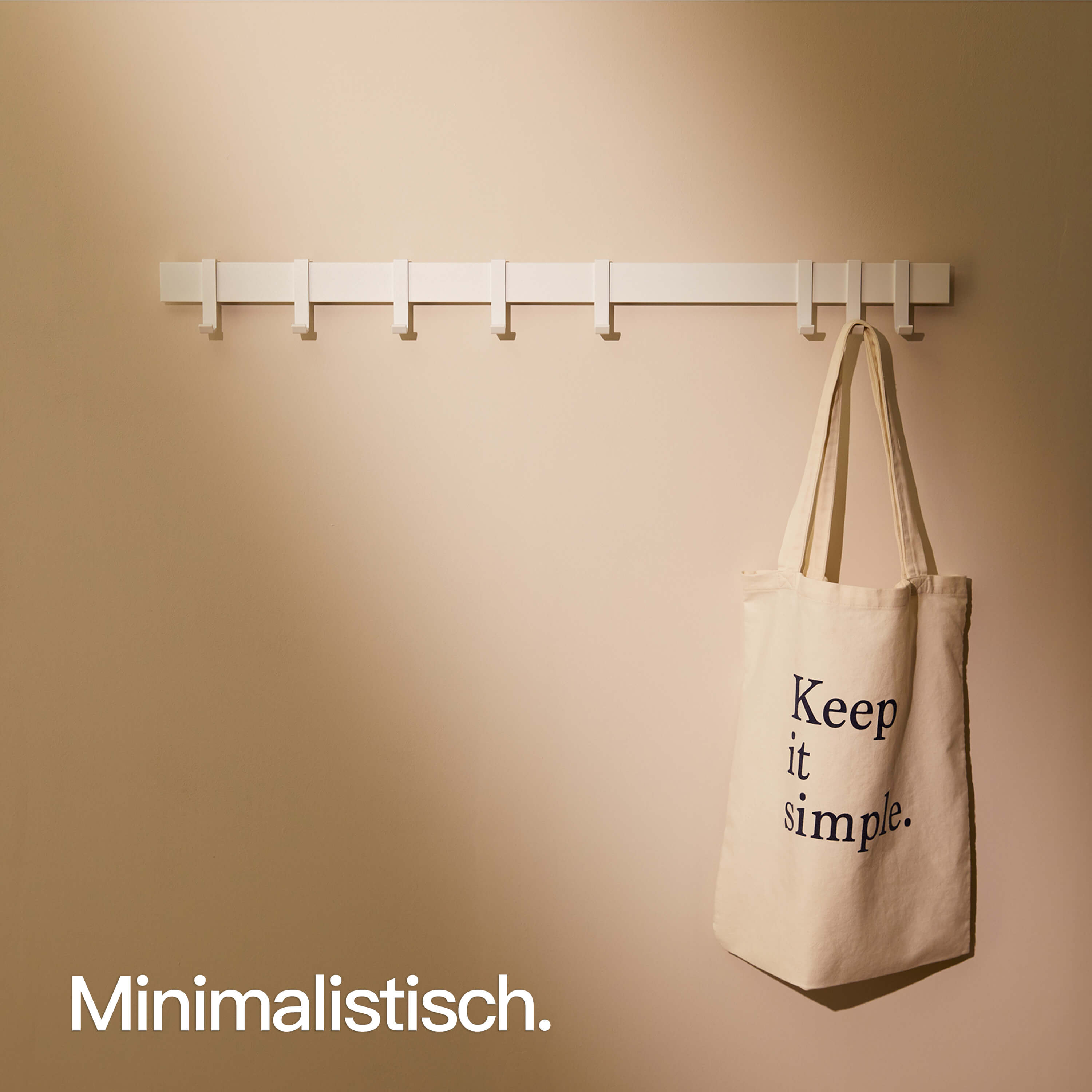
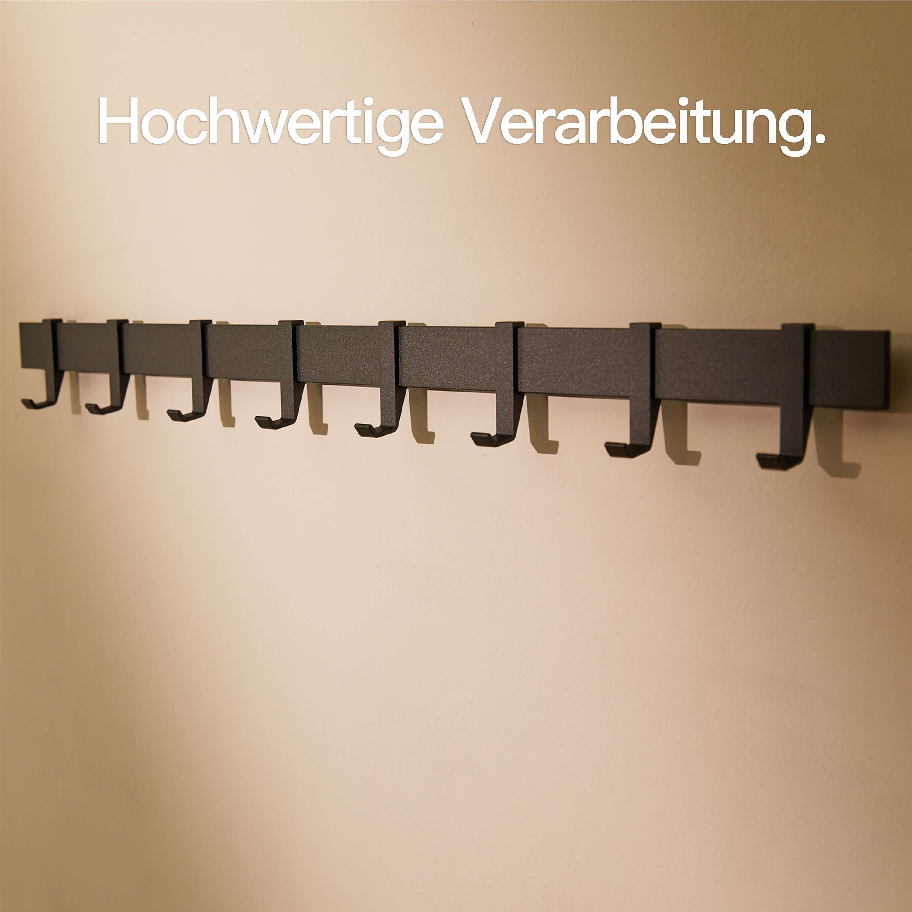
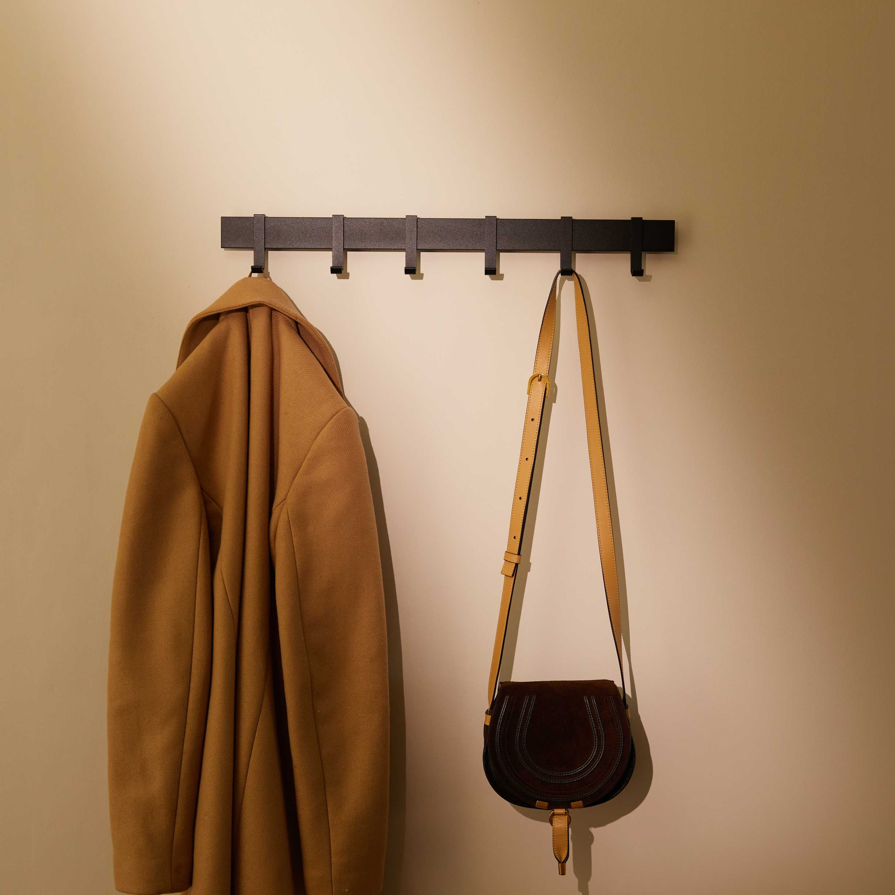
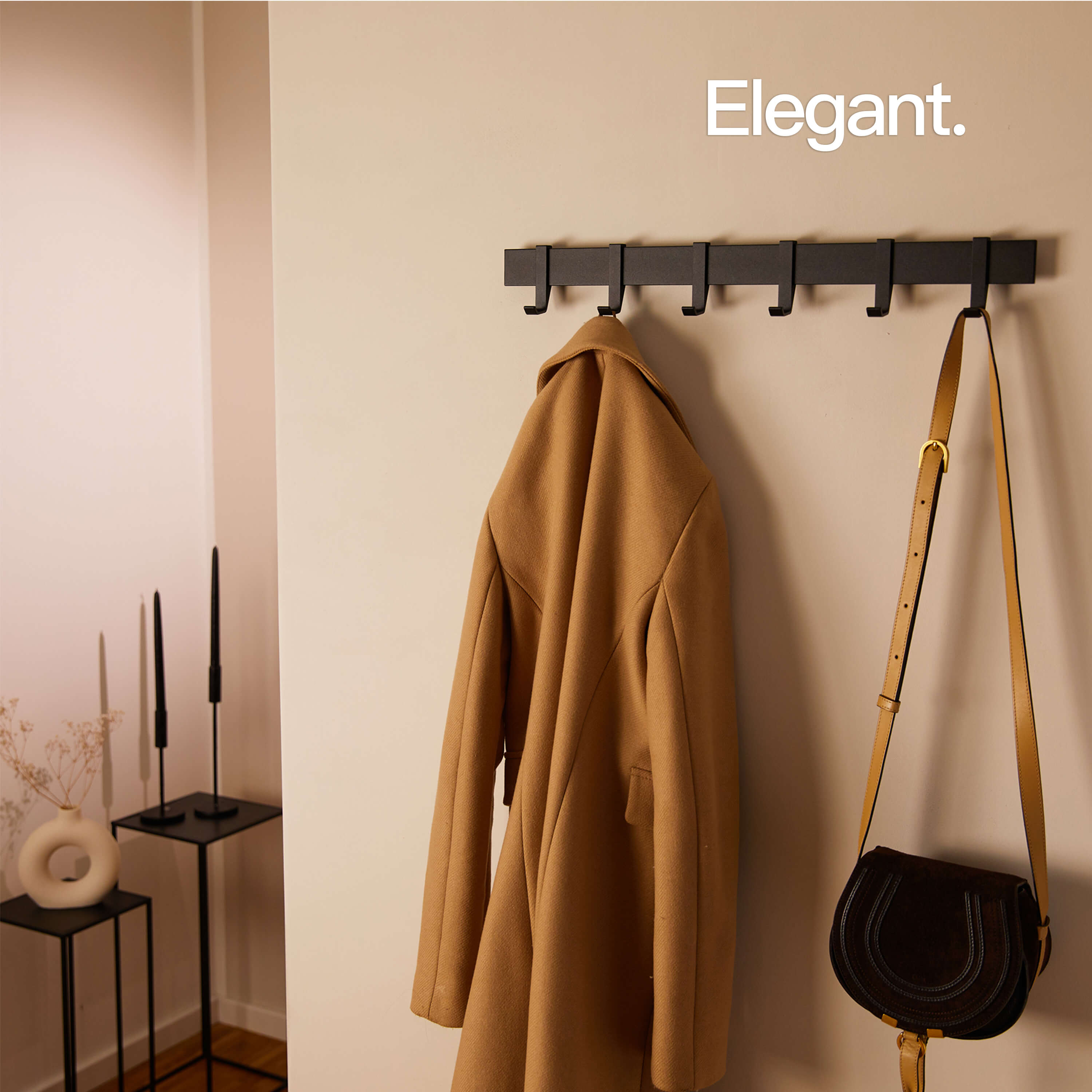
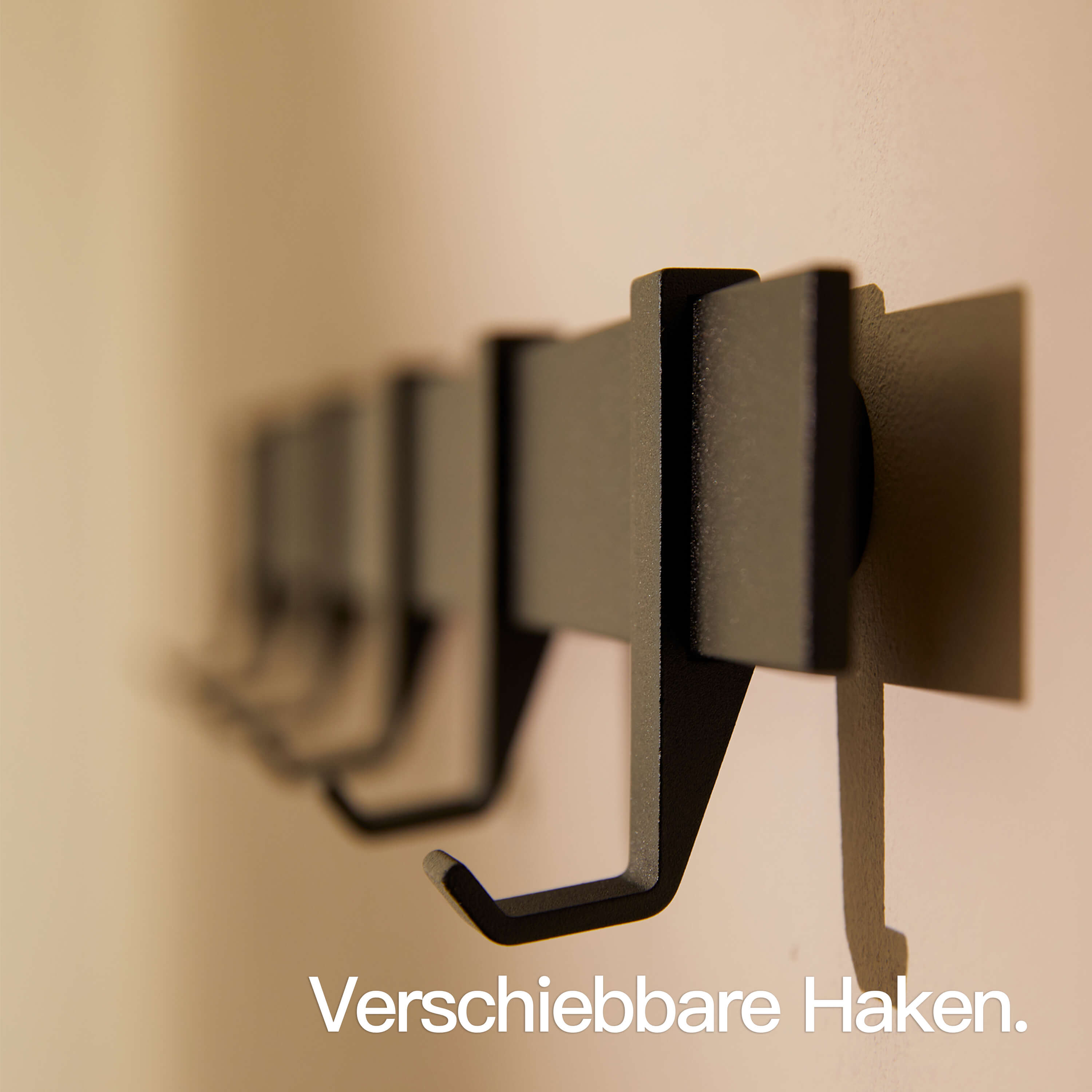
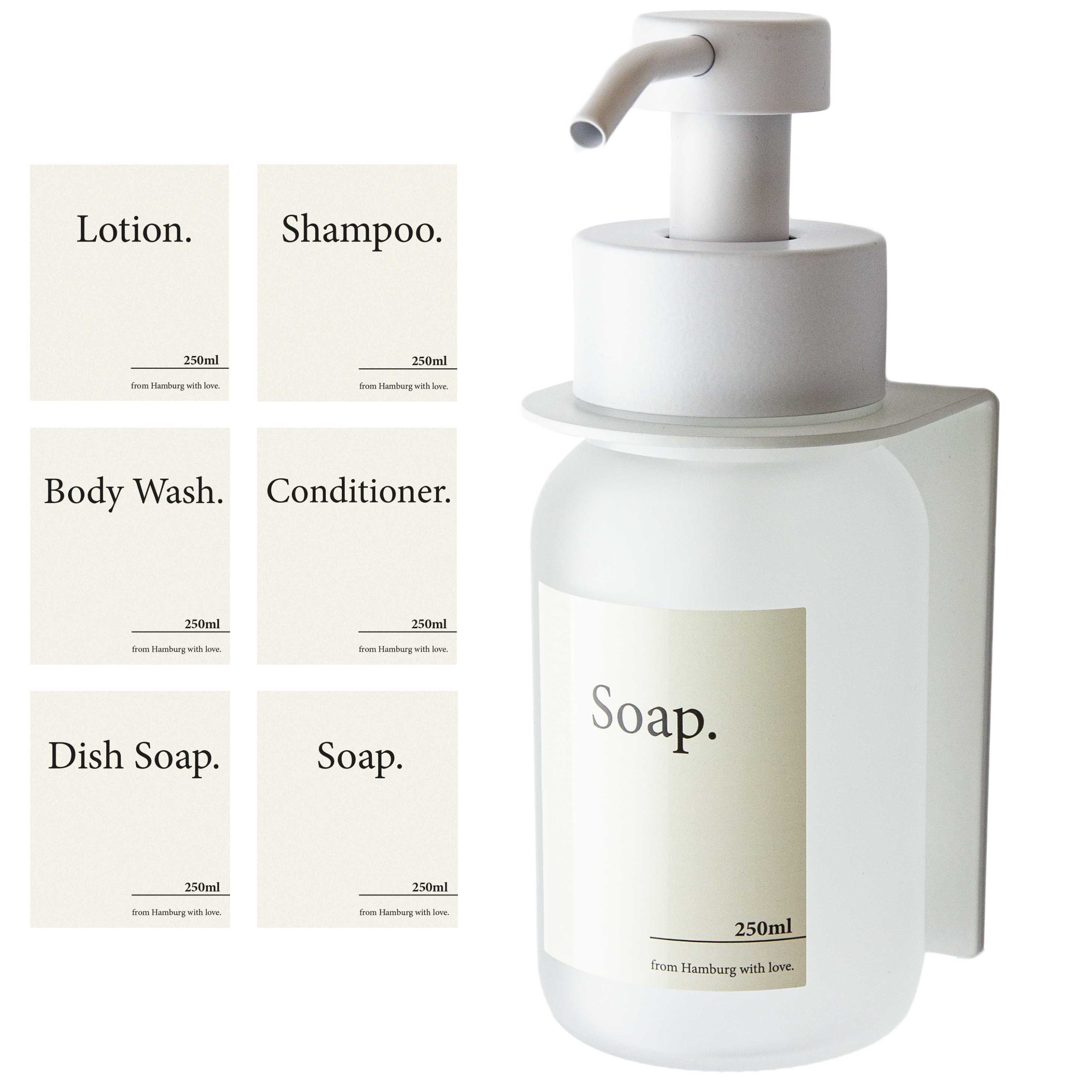
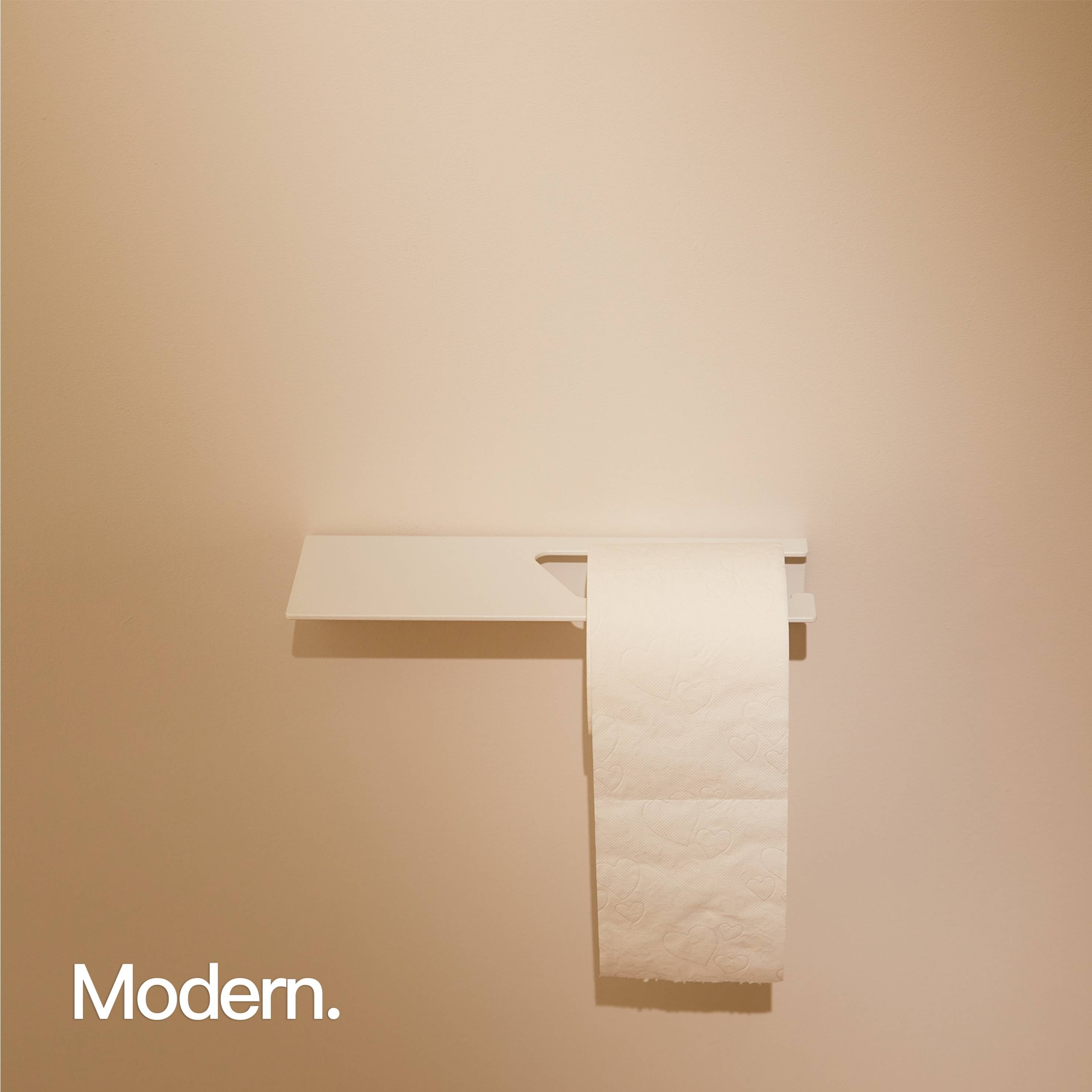
Designfabrik Hamburg Bestseller


Lively accents with bright colours
Soft tones and pastel shades
Consciously staging colours
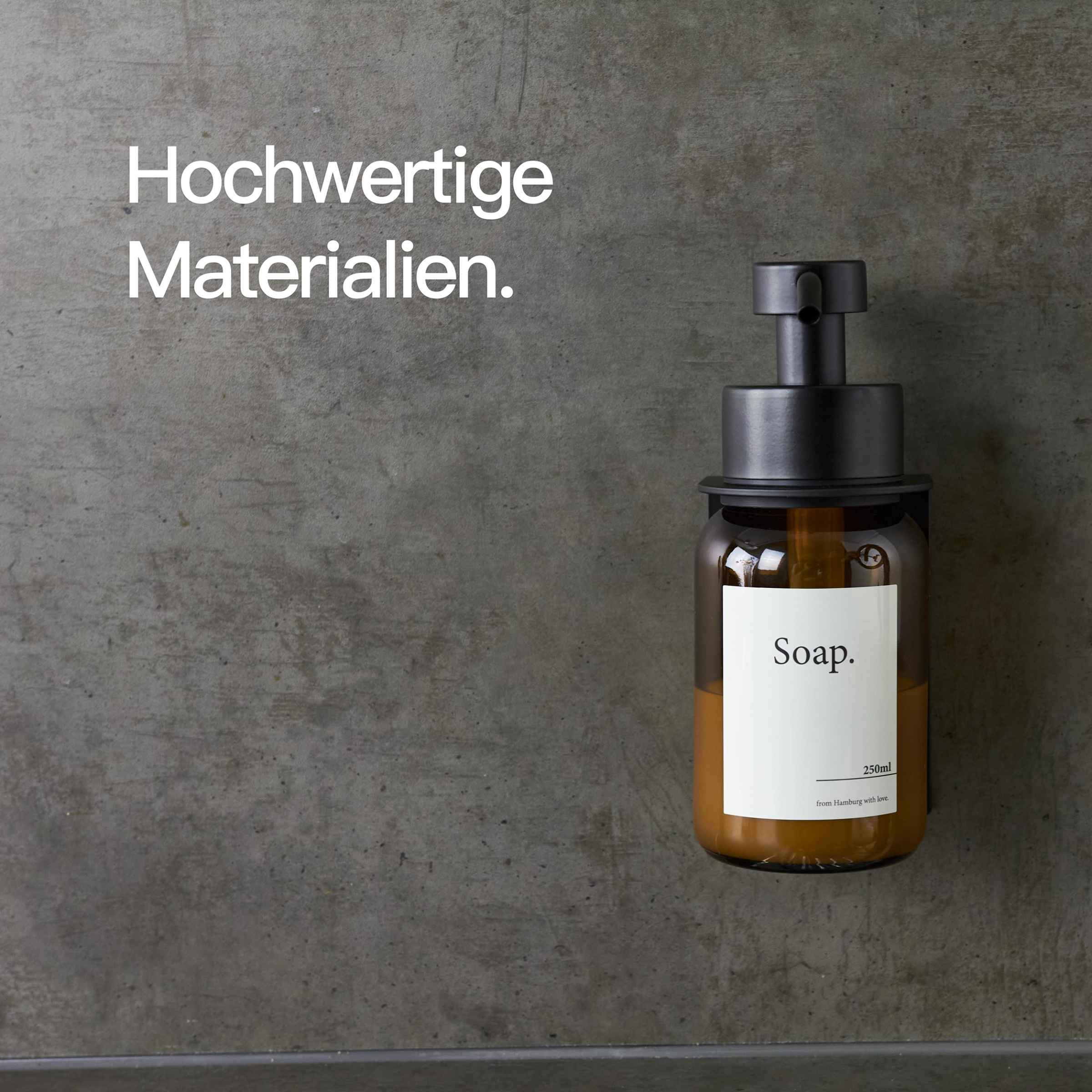
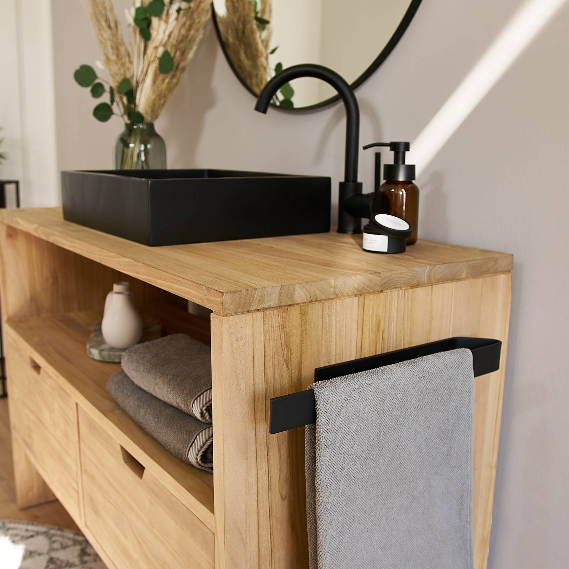
Earth tones as a basis
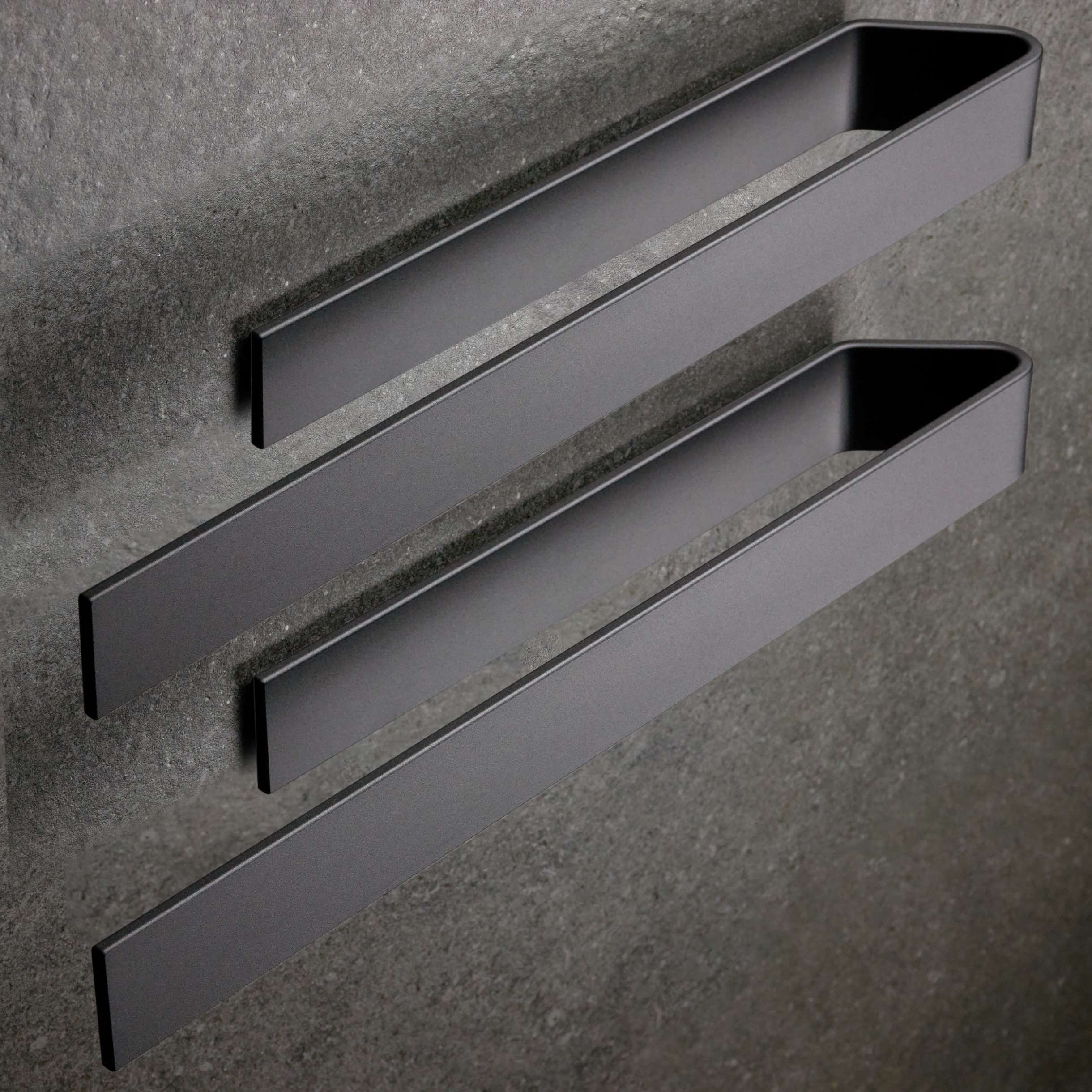
Black and white as structure providers
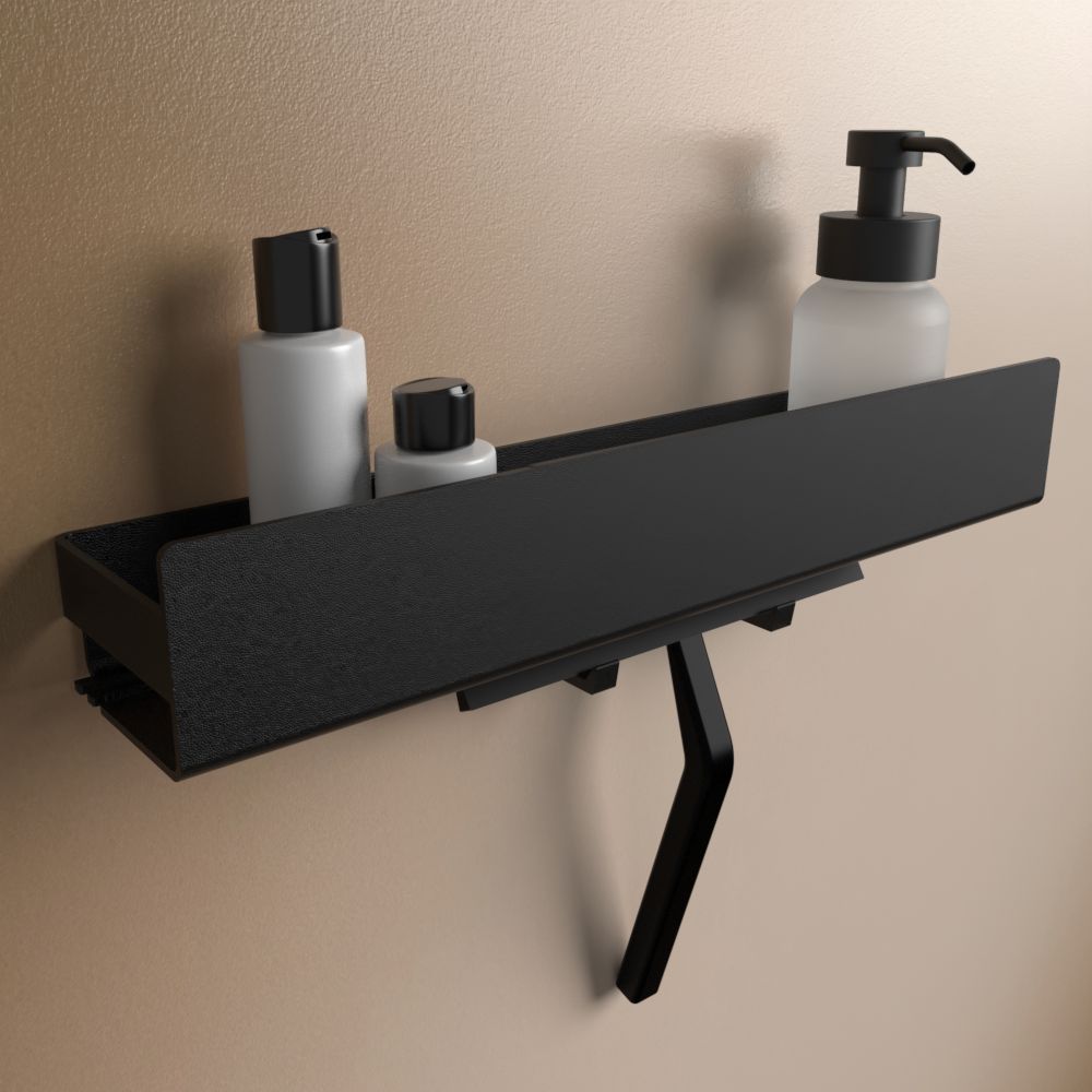
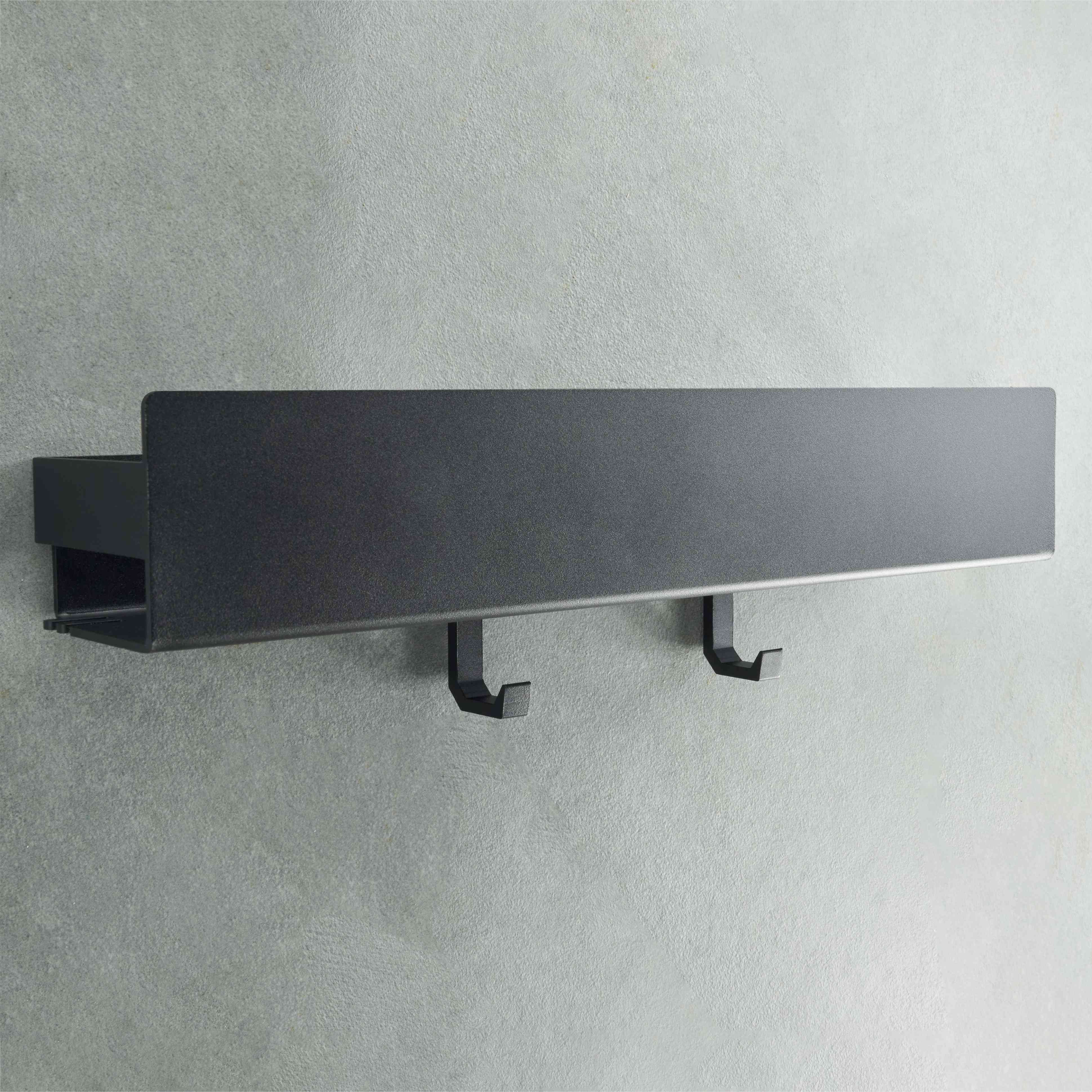
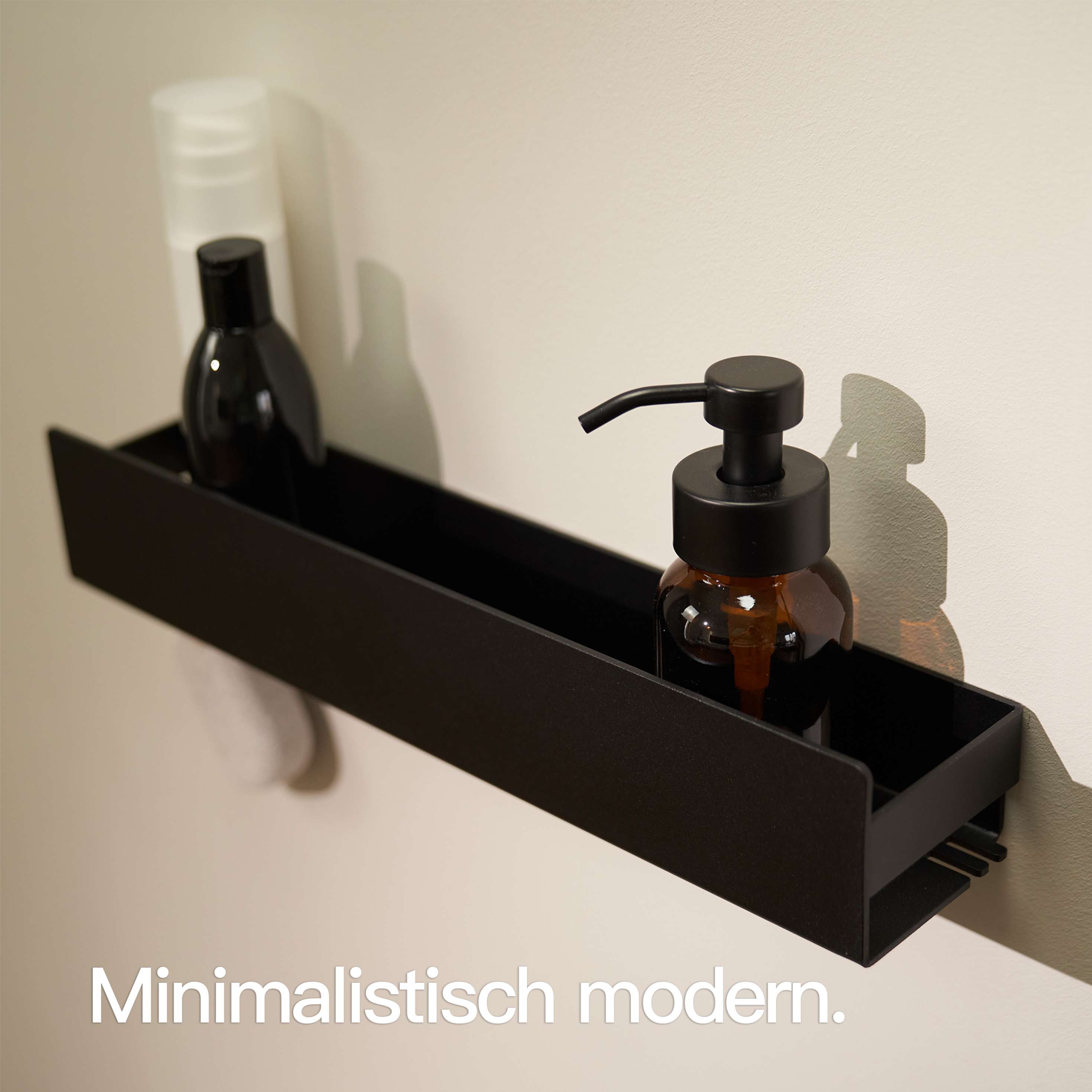
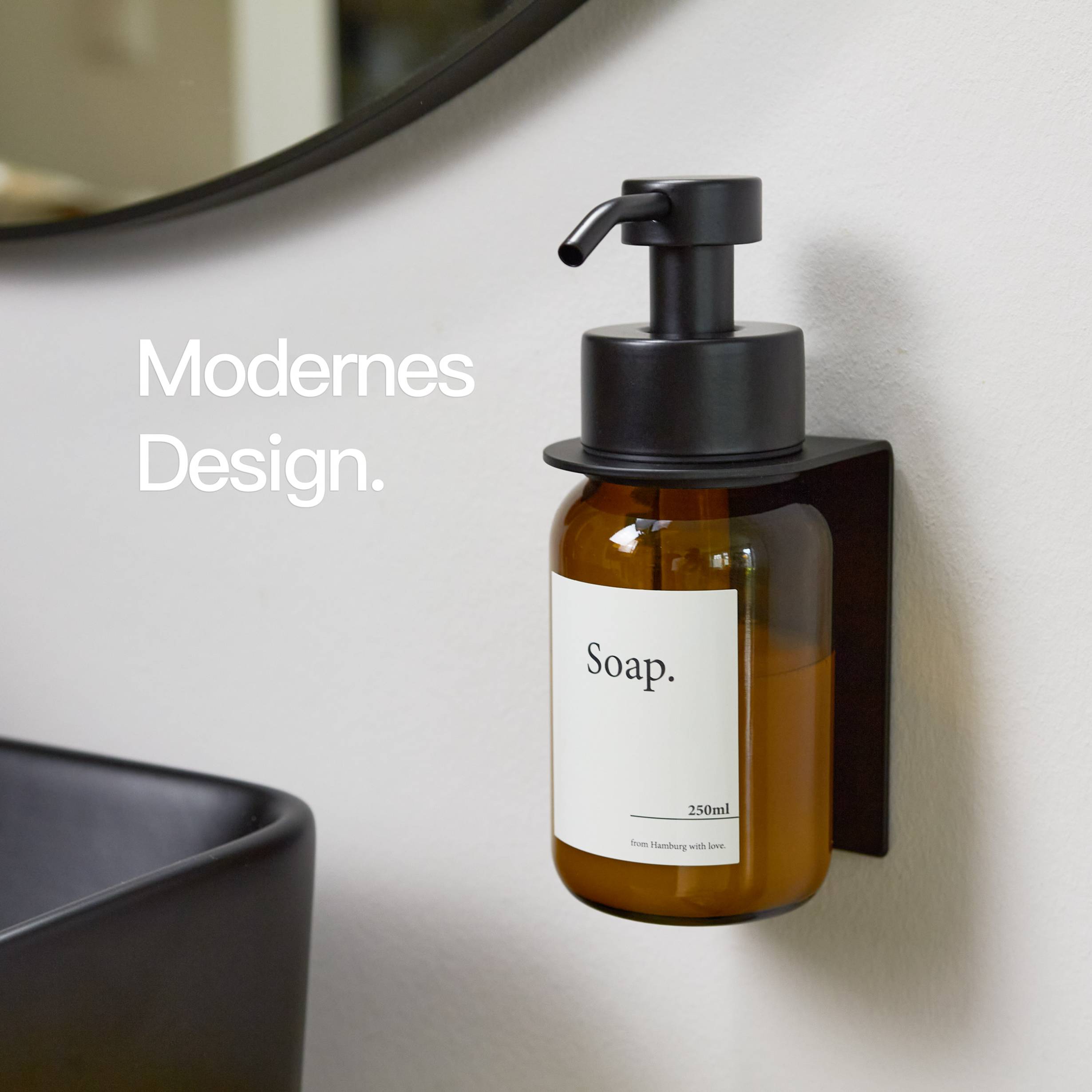
Metallic details
Pastel tones for lightness
Vibrant colours as accent

Discover individual colour worlds
Which colours will dominate the home trends in 2025?
How can I incorporate modern details without taking the focus away from the colours?
Why are black and white still trendy?
Which rooms particularly benefit from pastel colours?
How do I use vibrant colours skillfully?
Über Designfabrik Hamburg


Read more

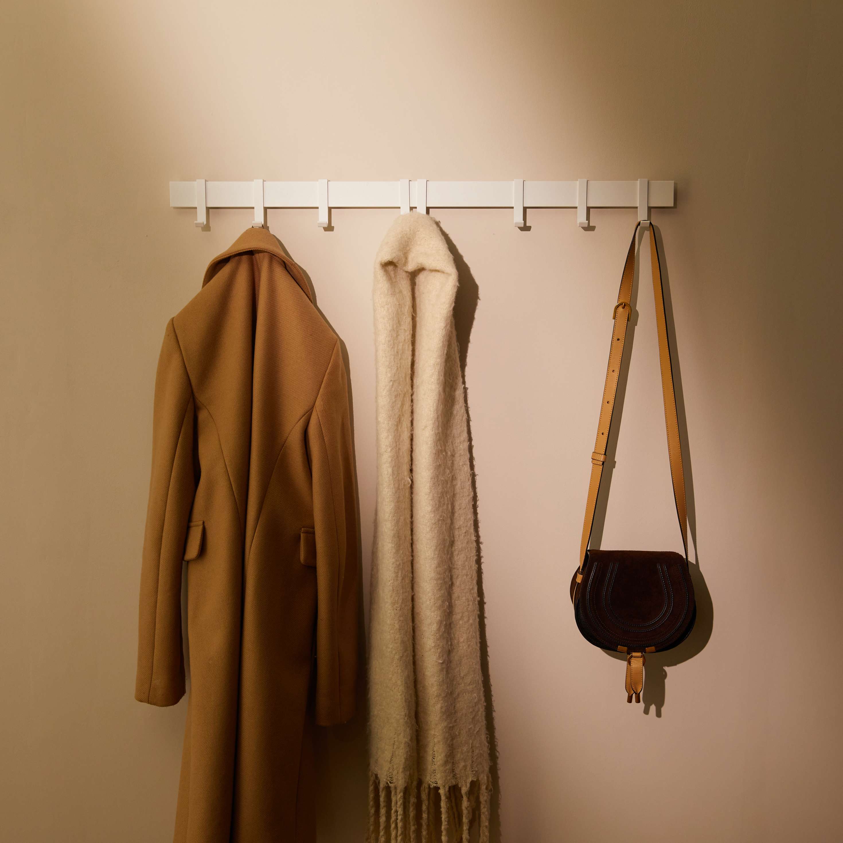
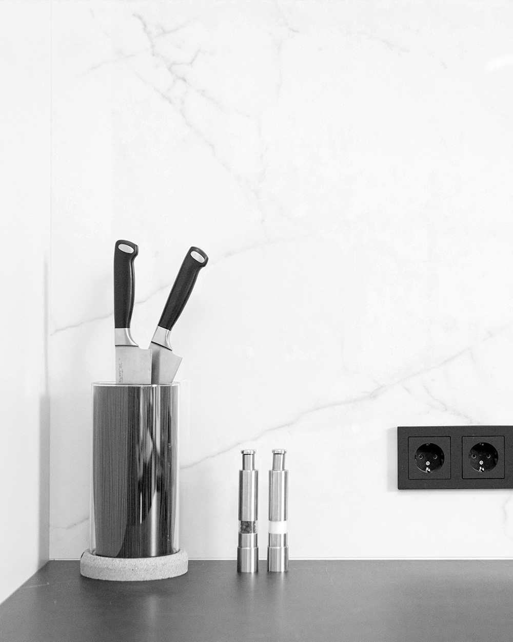
Quickly tidied up: 5 areas that will make your home feel calmer immediately
Sometimes your home feels chaotic, even though there isn’t actually much clutter. The reason often lies in a few areas that immediately catch the eye: the sink, shower, kitchen countertop, hallway, or towels. When these zones are more organized, the whole room feels more relaxed. The best part: you don’t need a big cleaning spree, just a few designated spots.

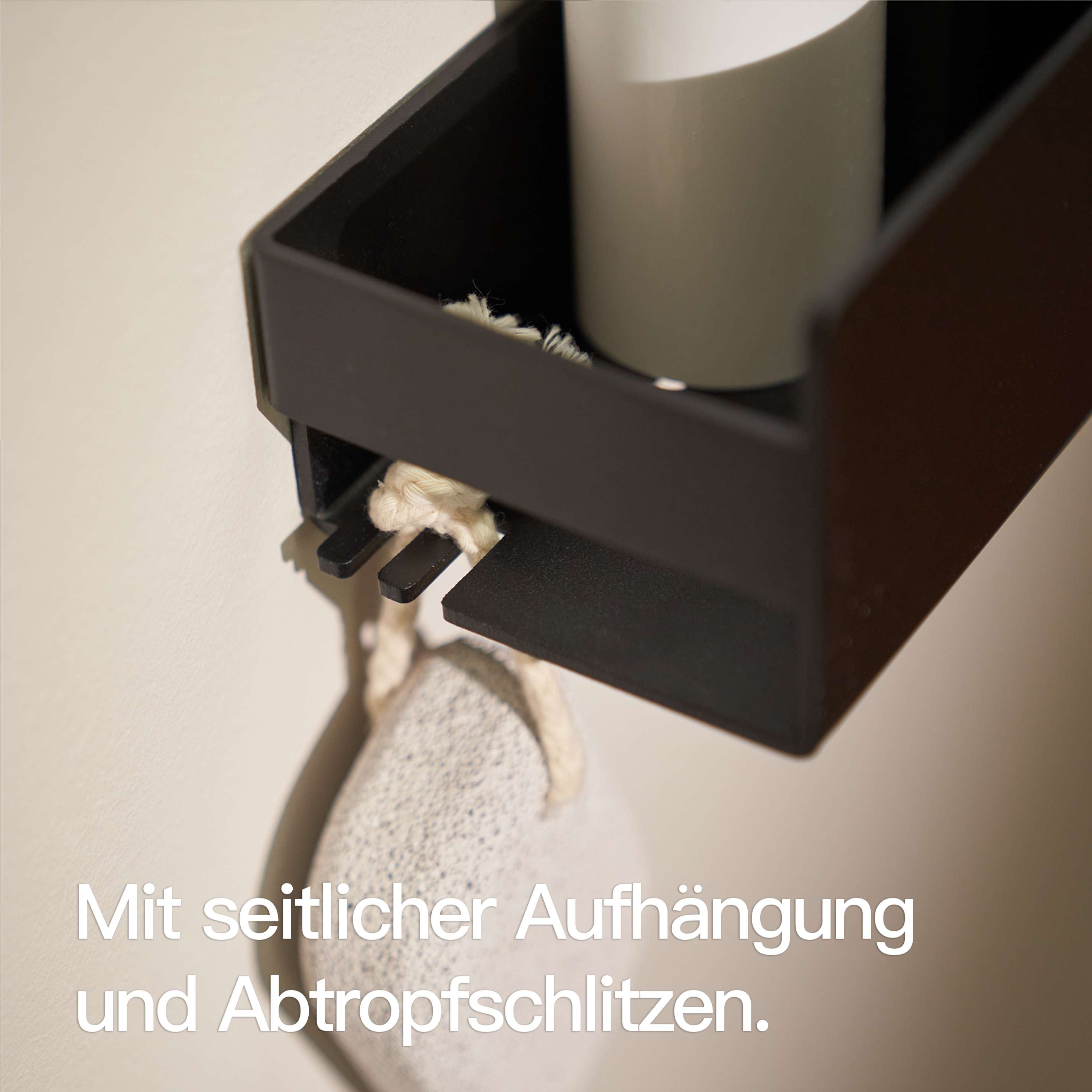
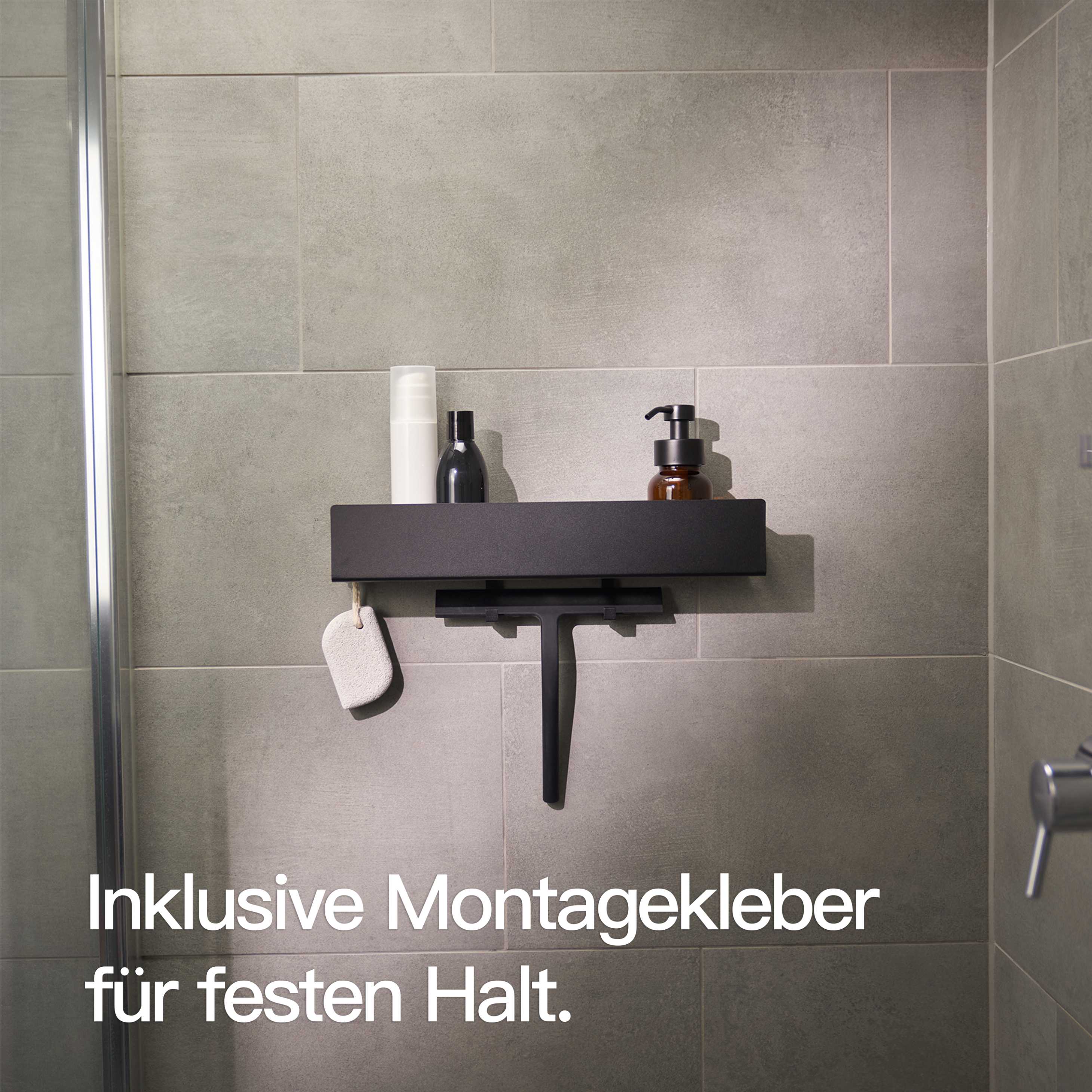
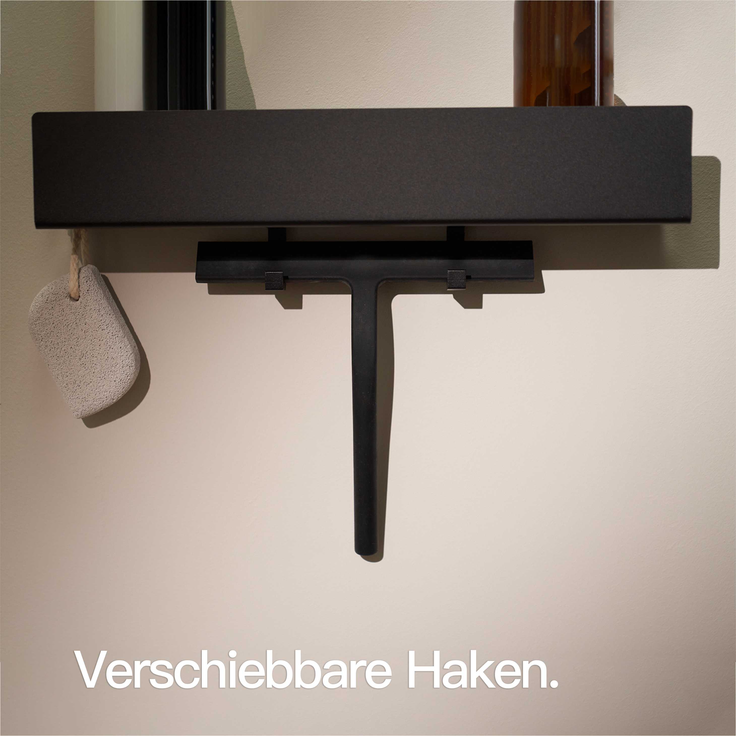
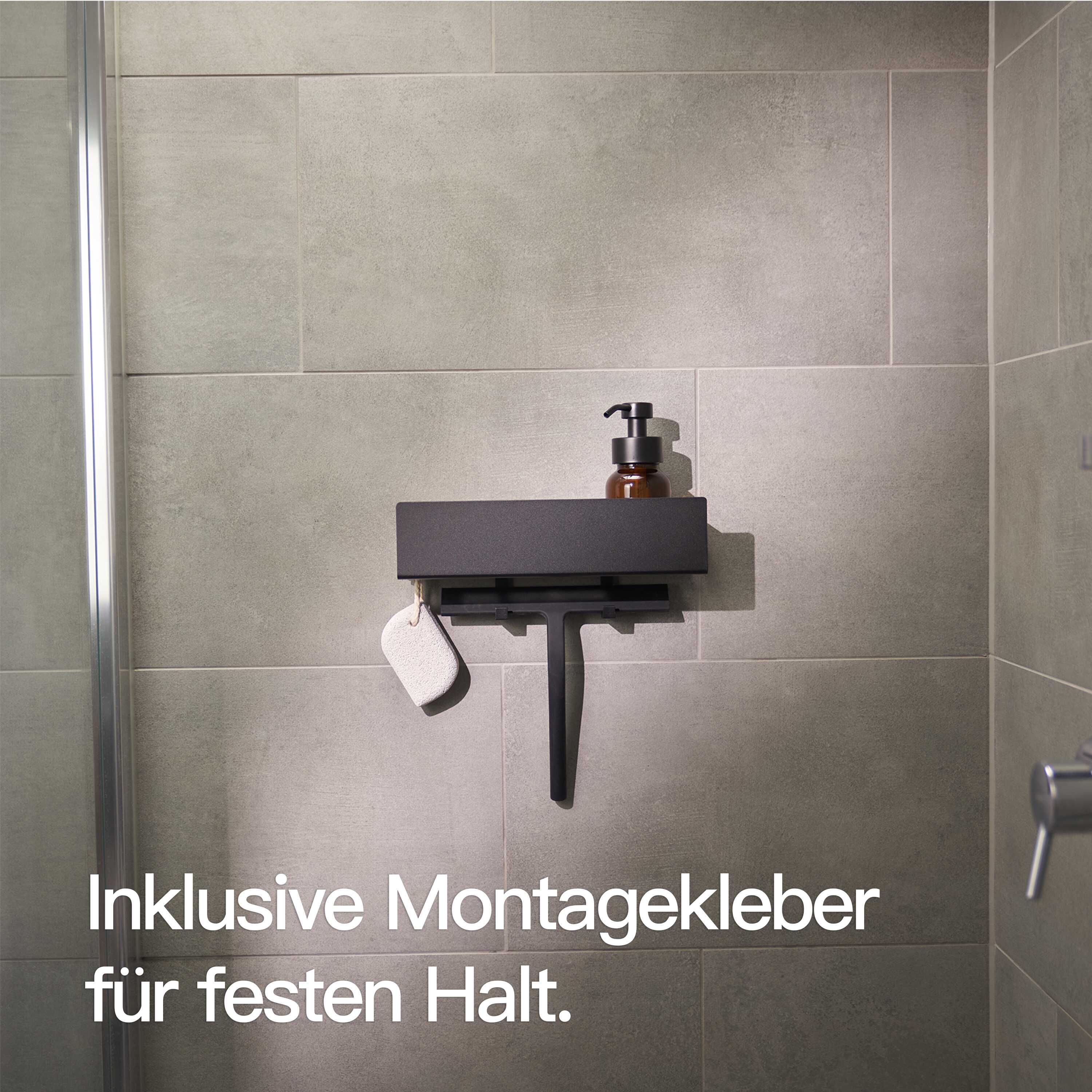
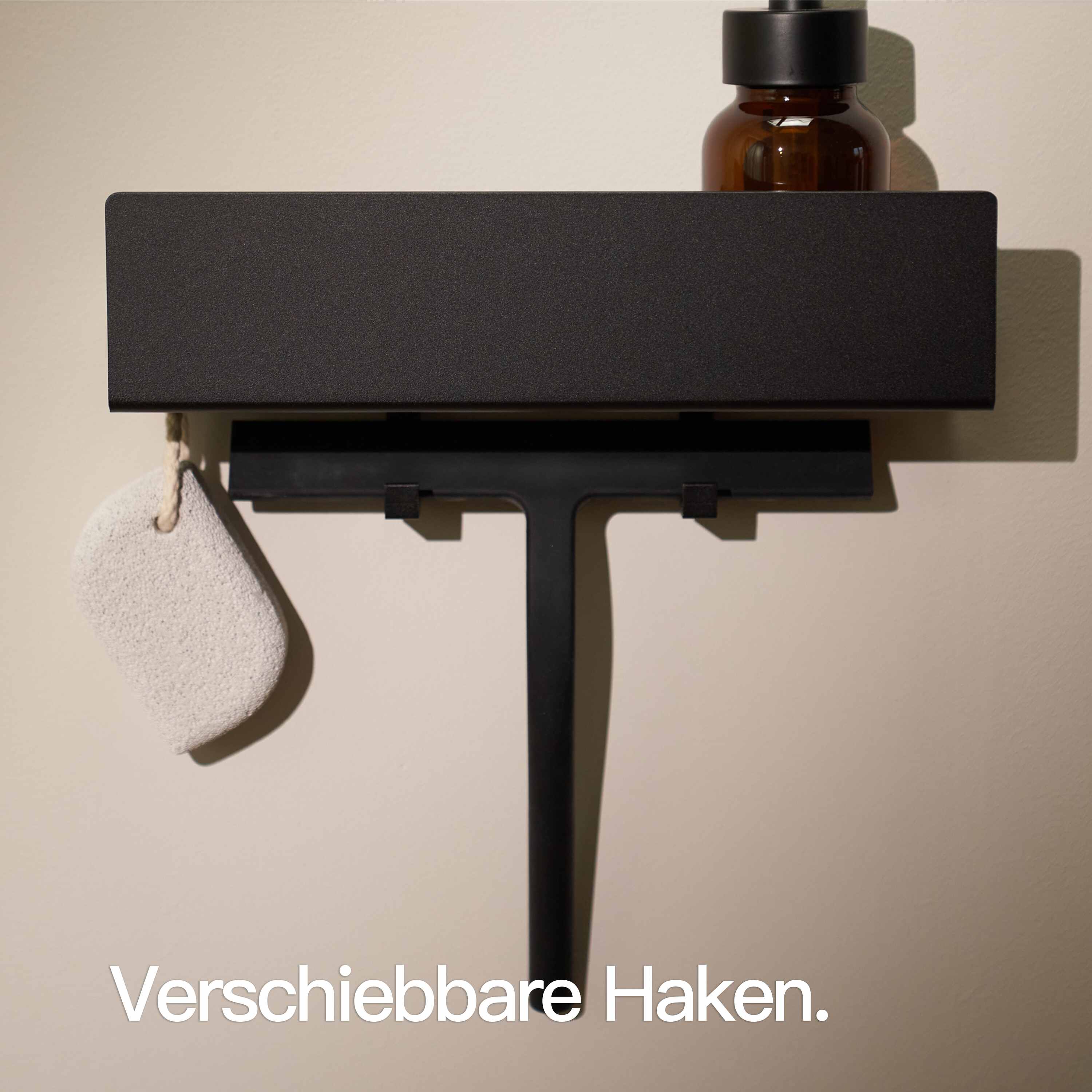
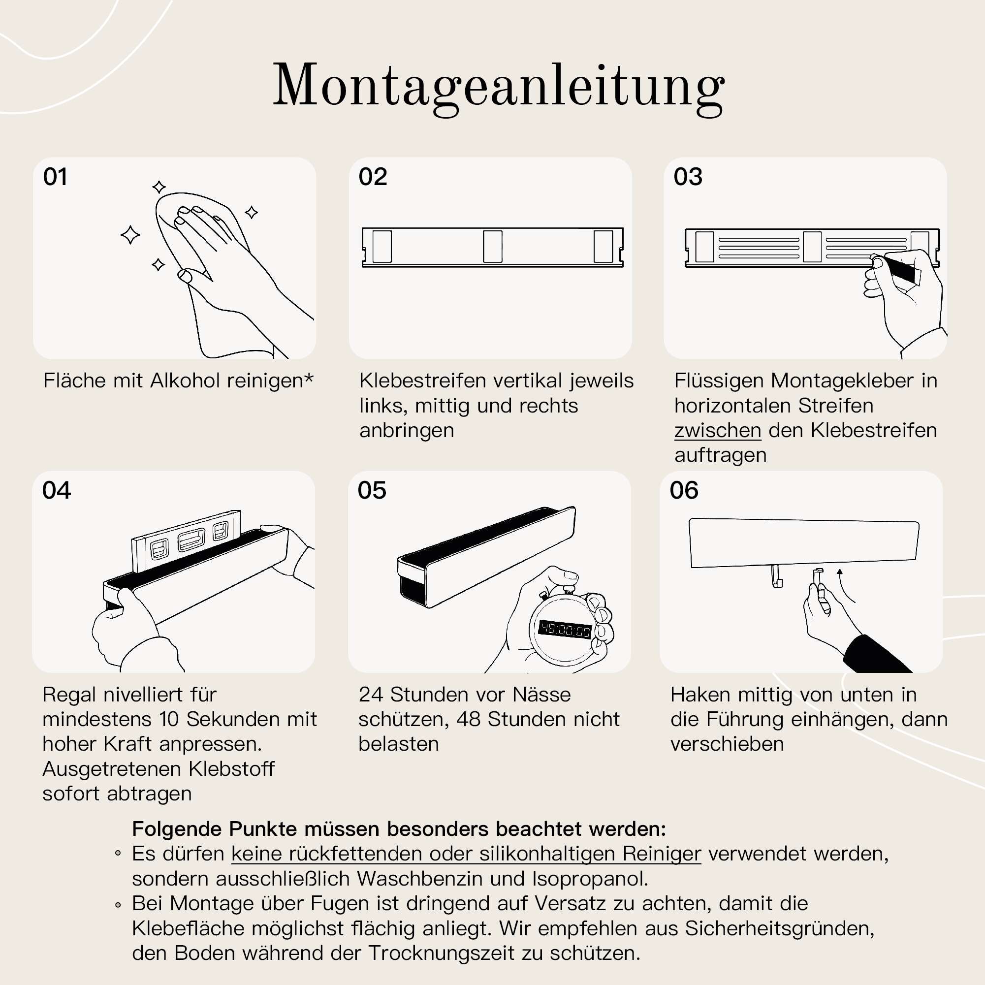
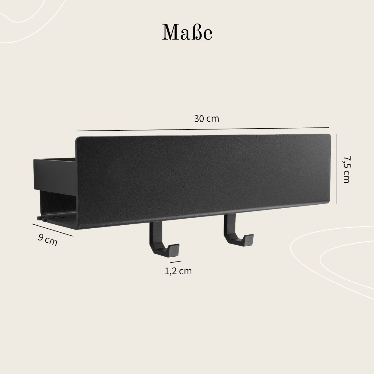
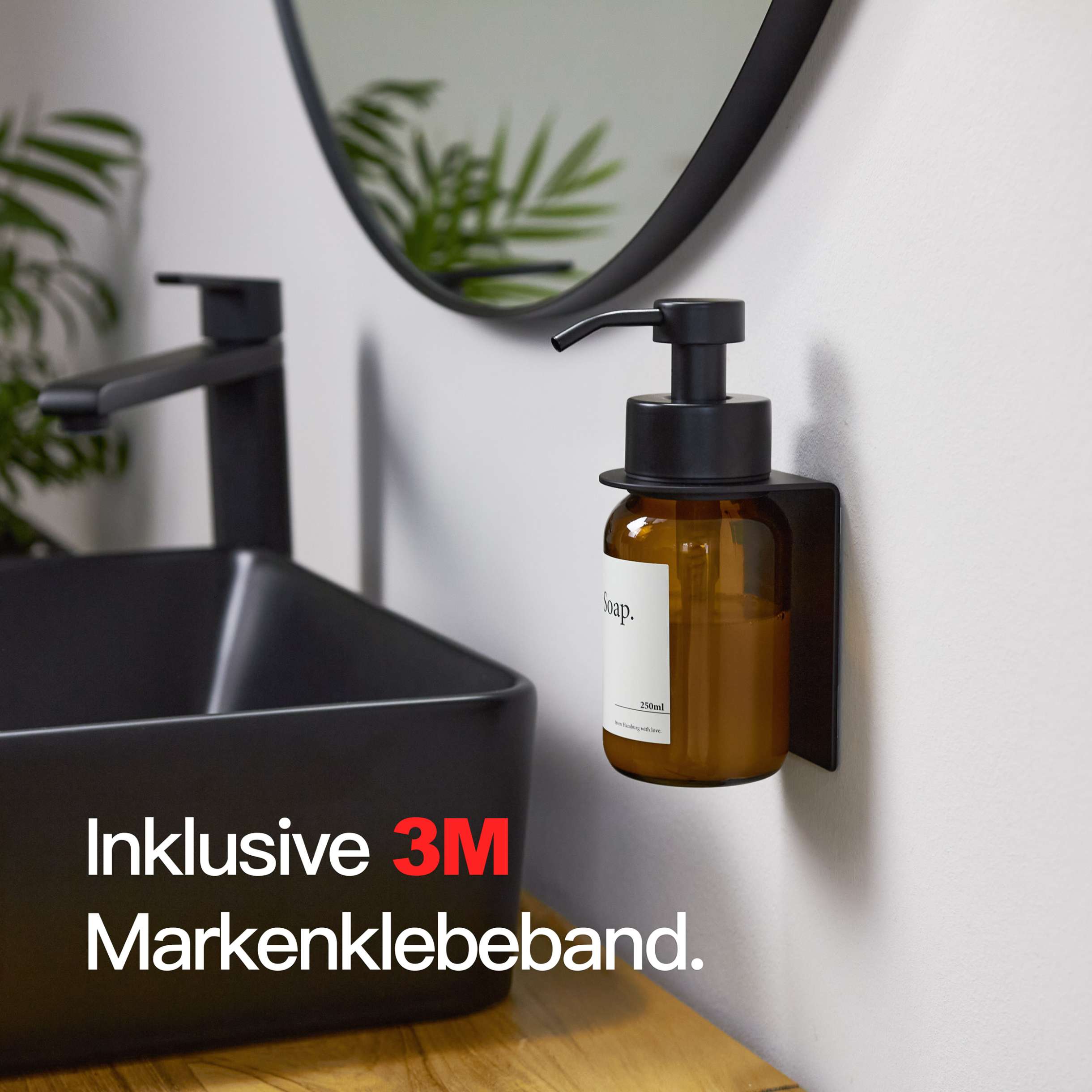
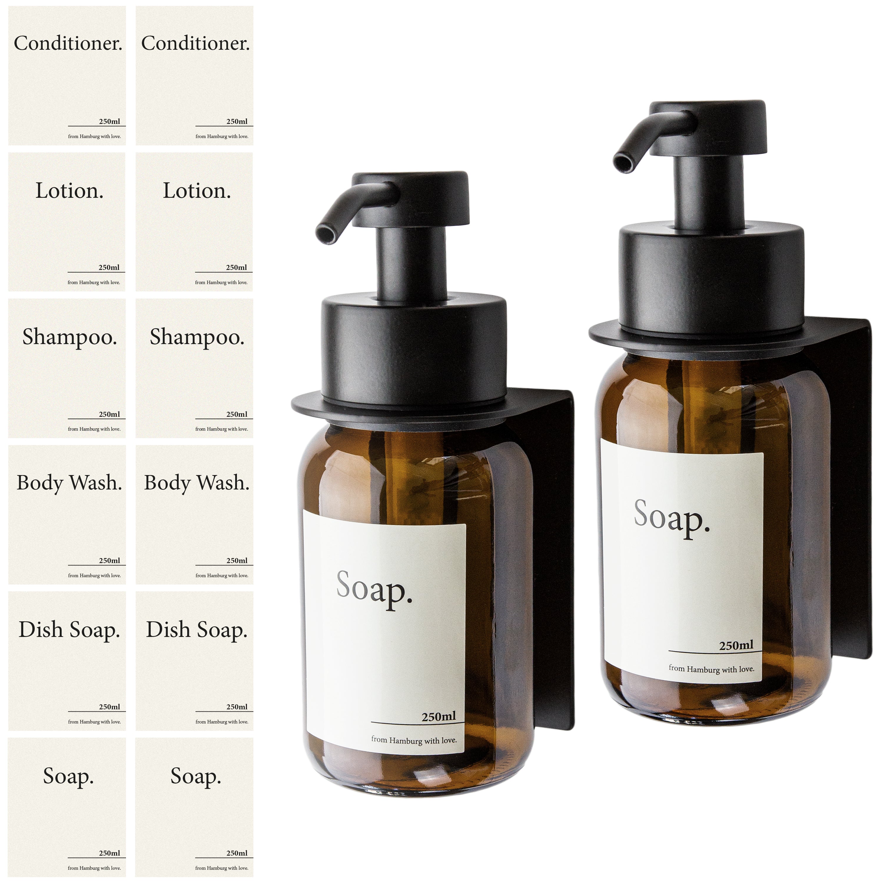
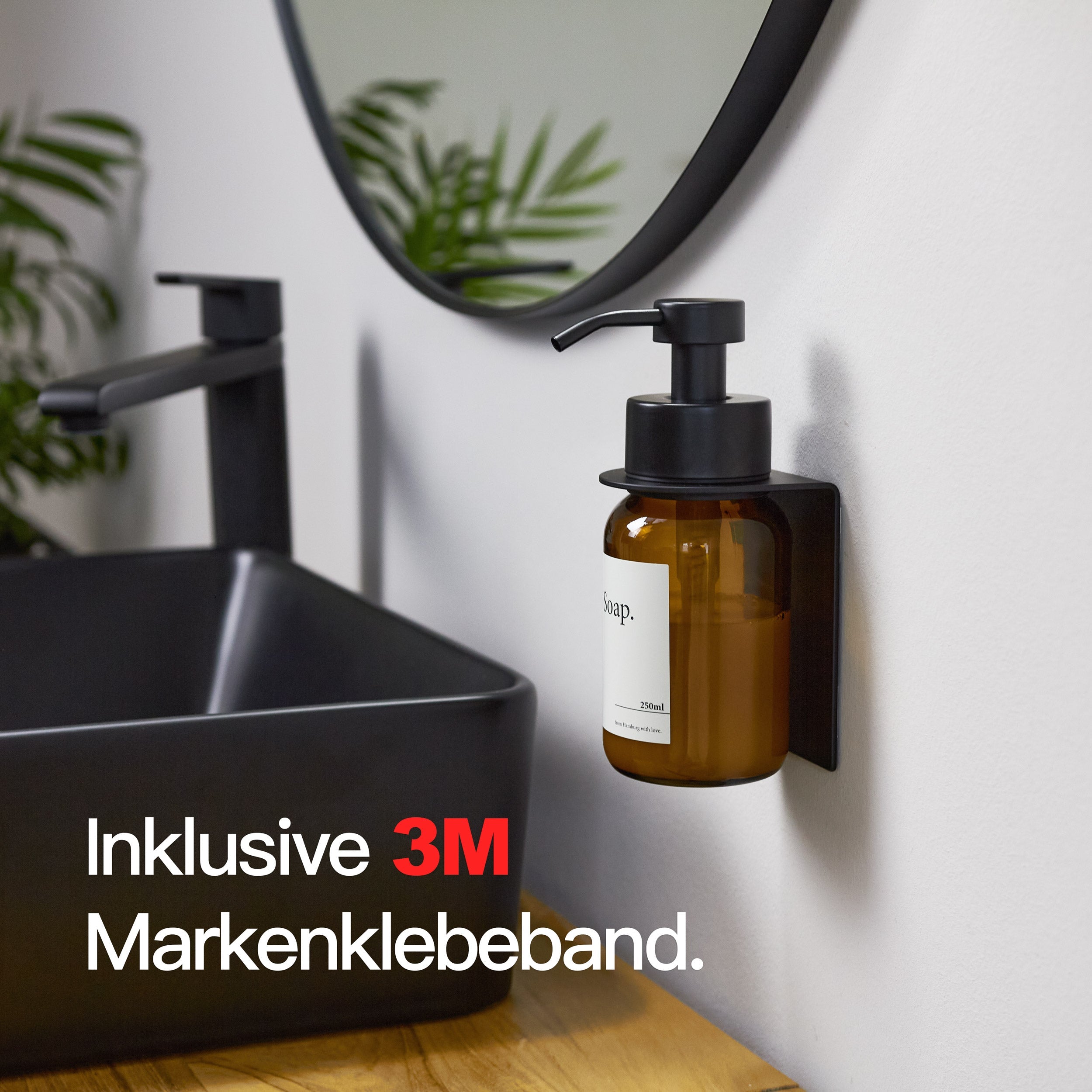
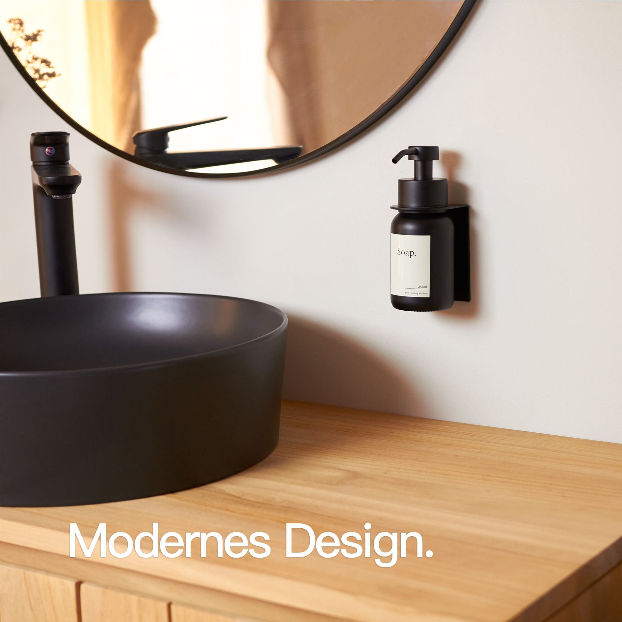
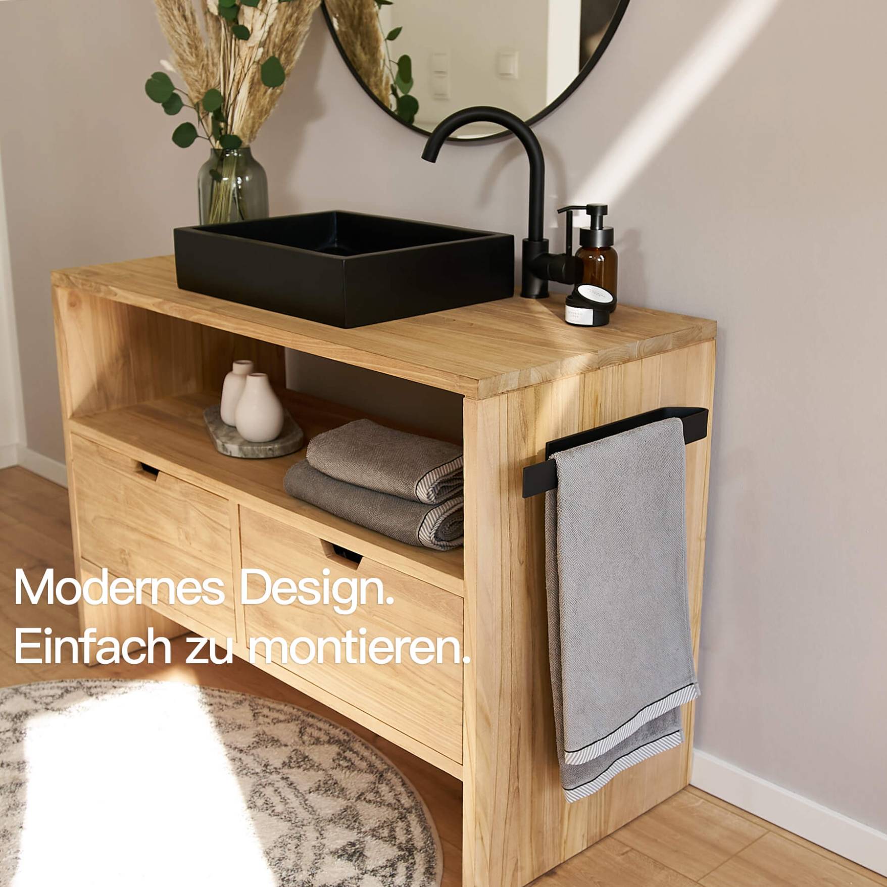
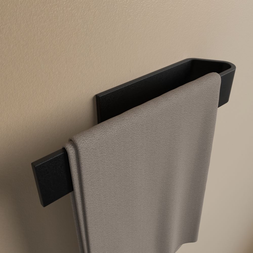
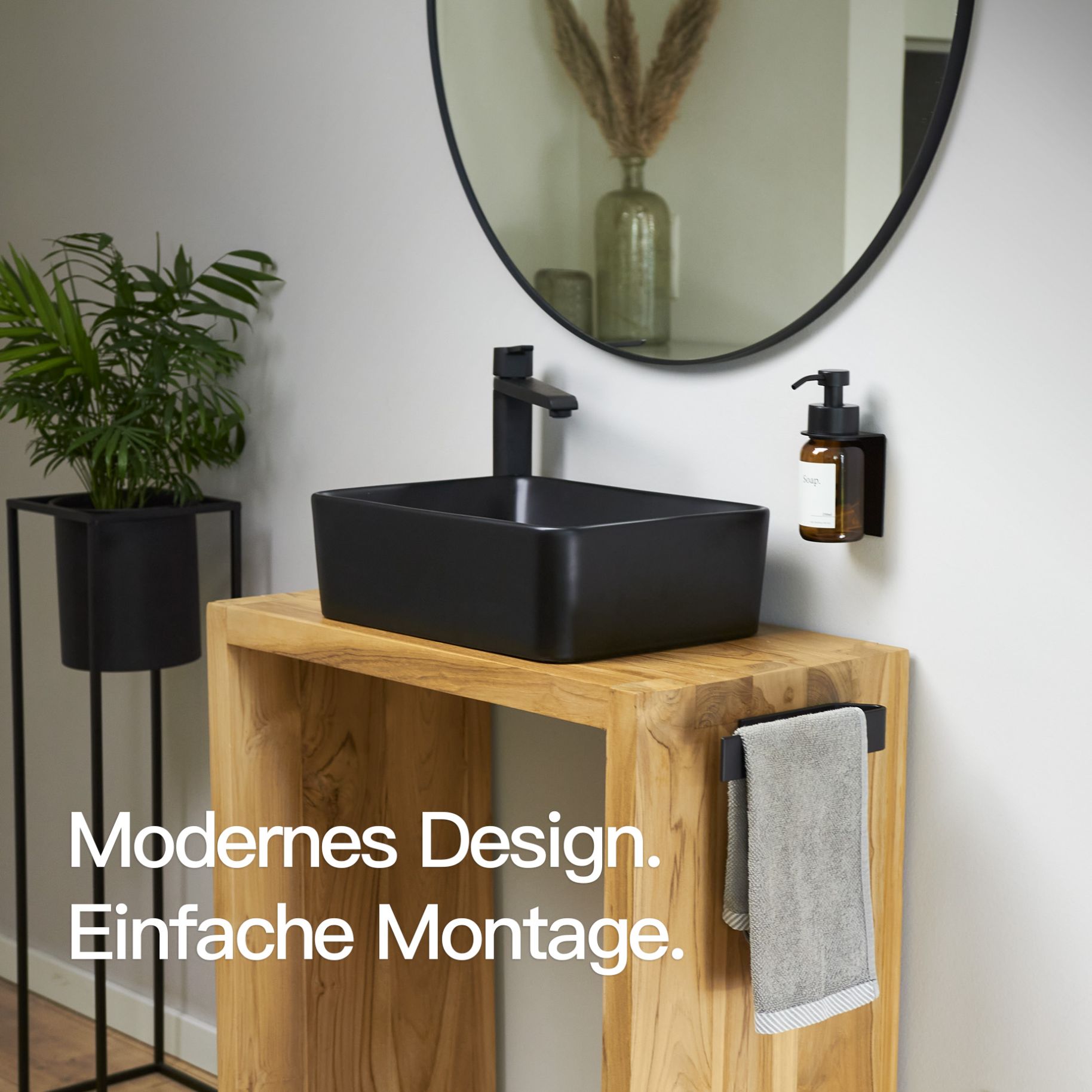
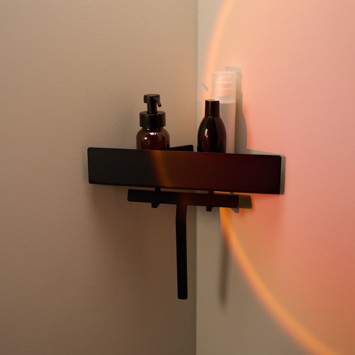
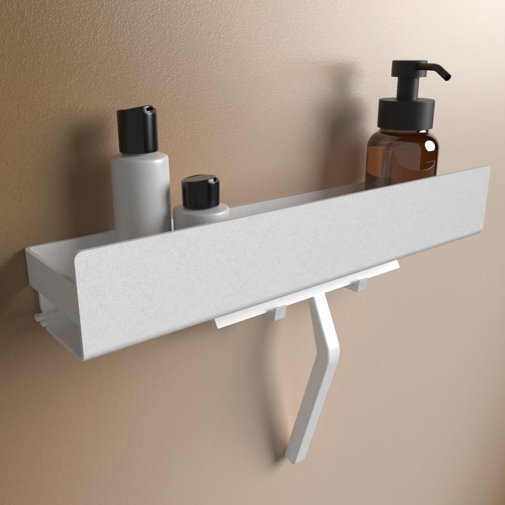
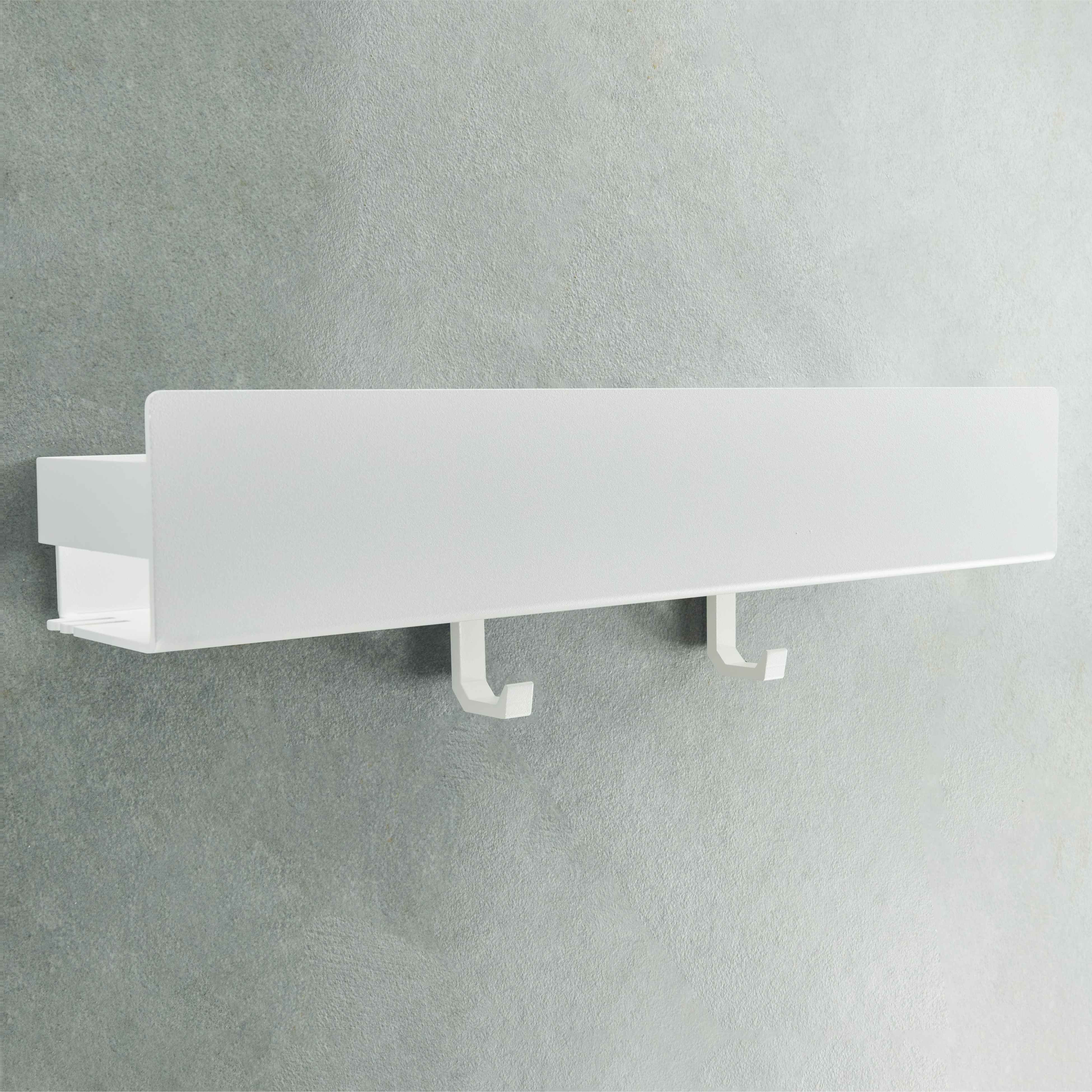
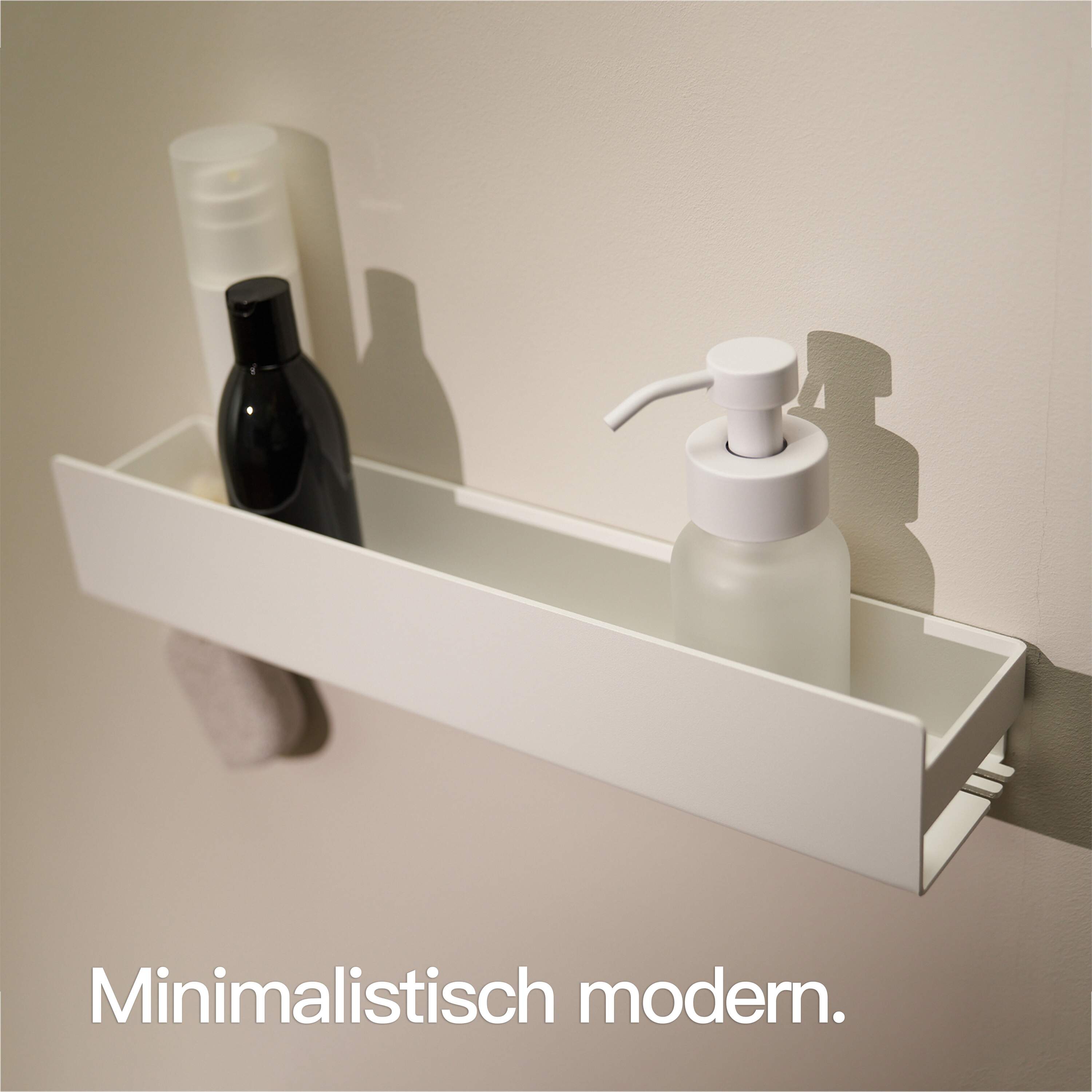
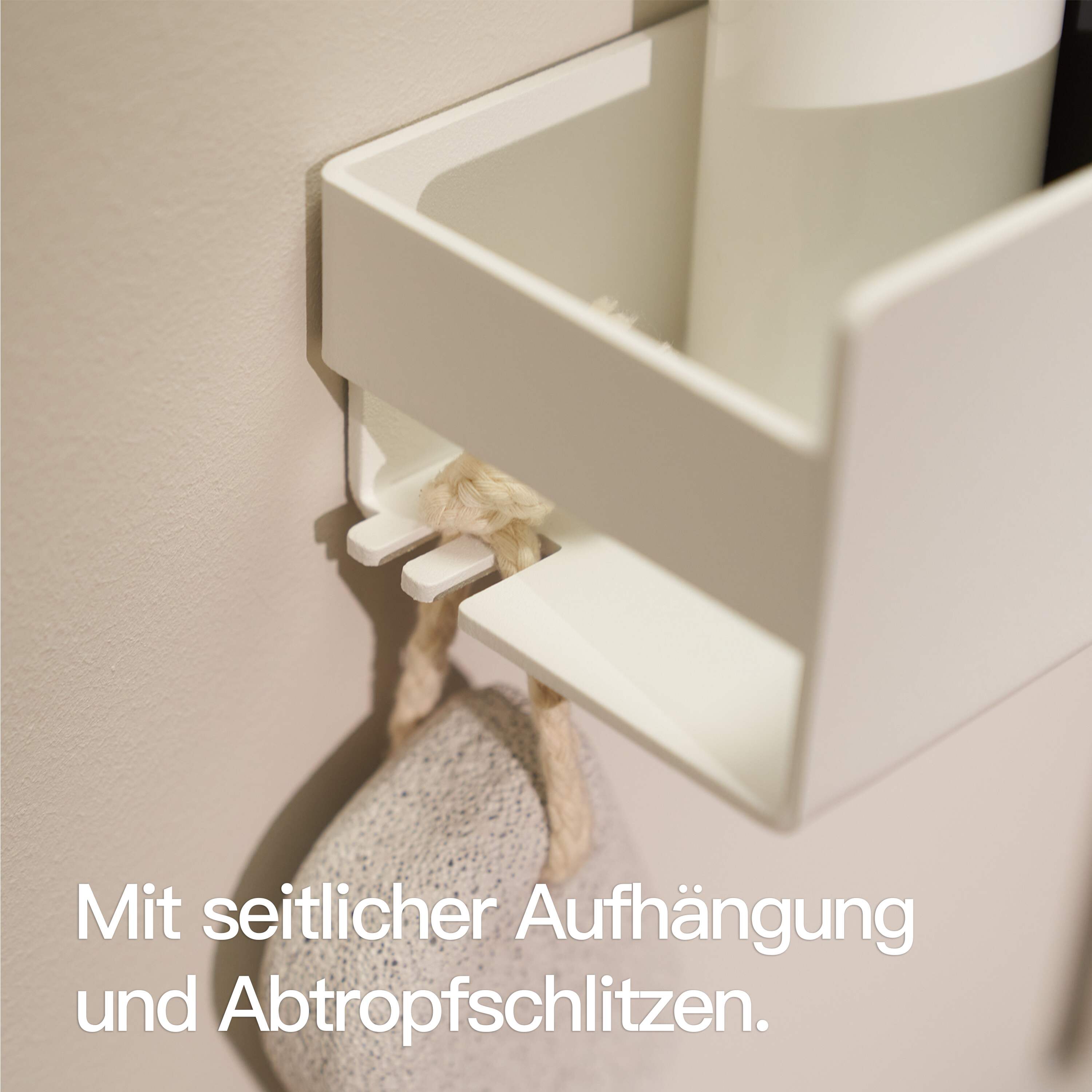
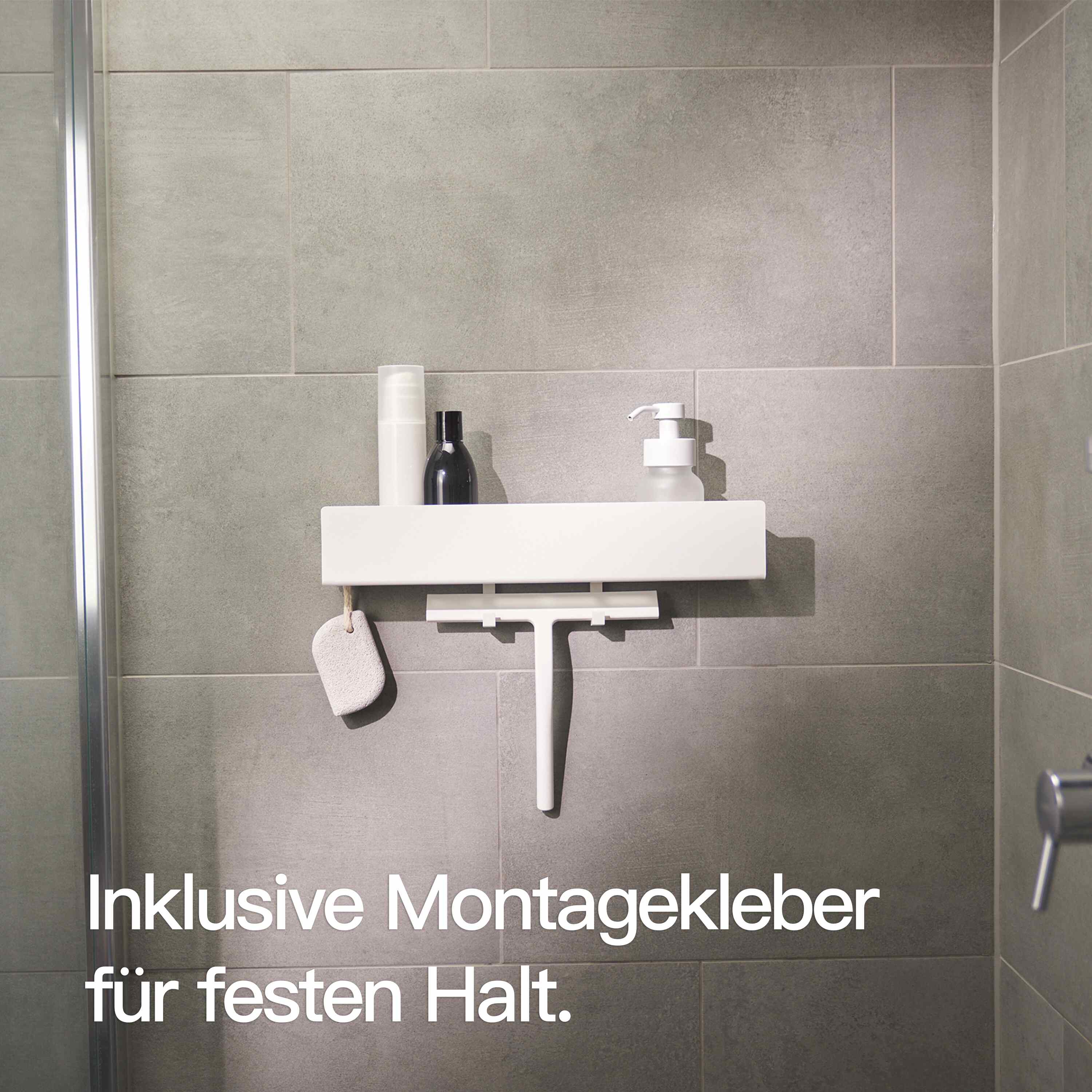
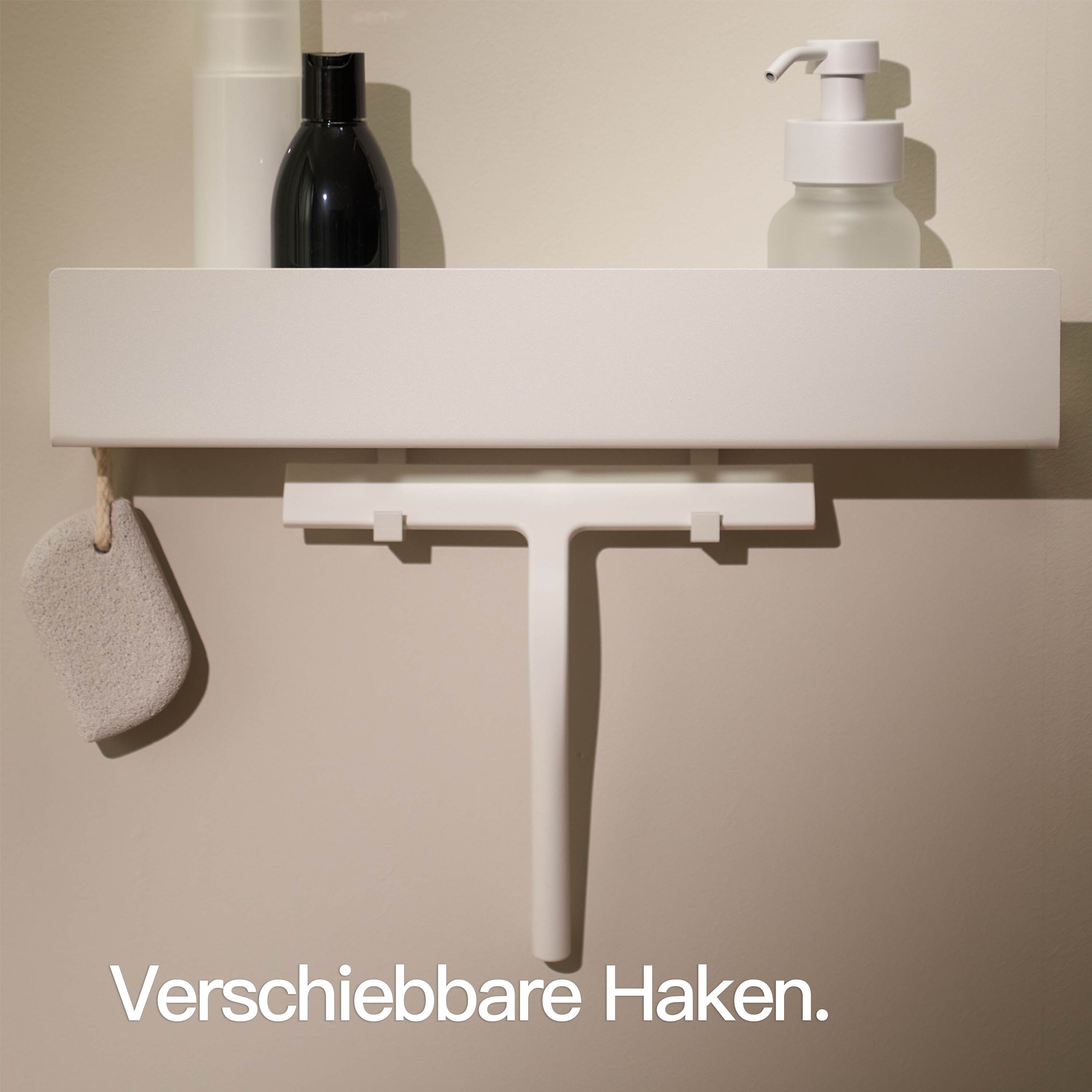
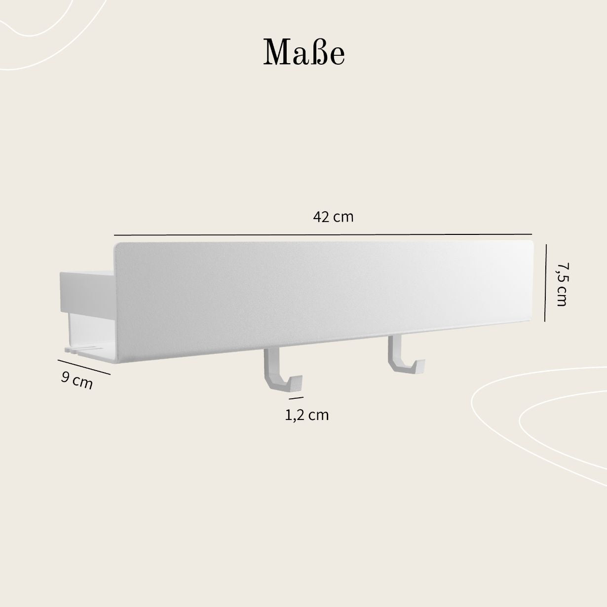
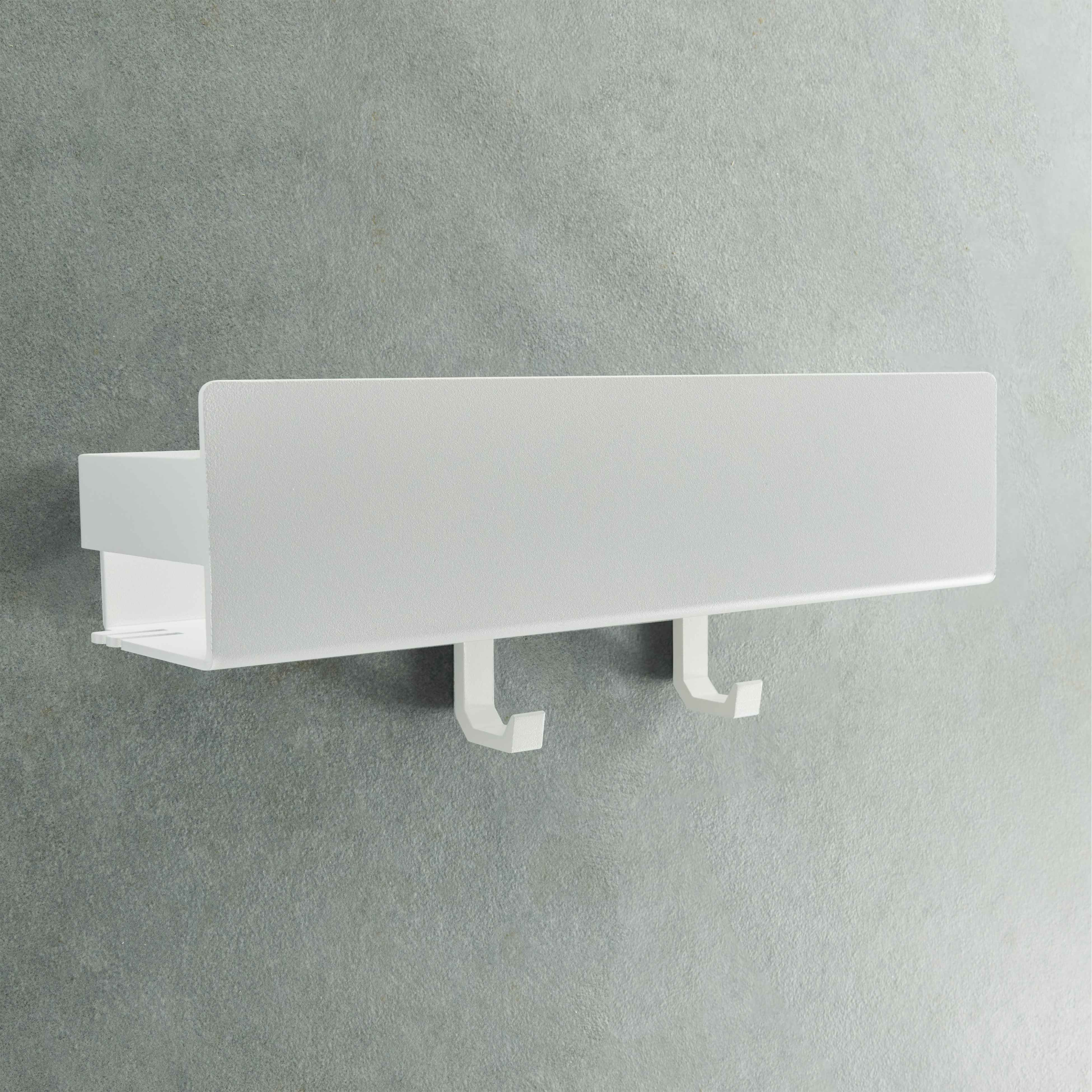
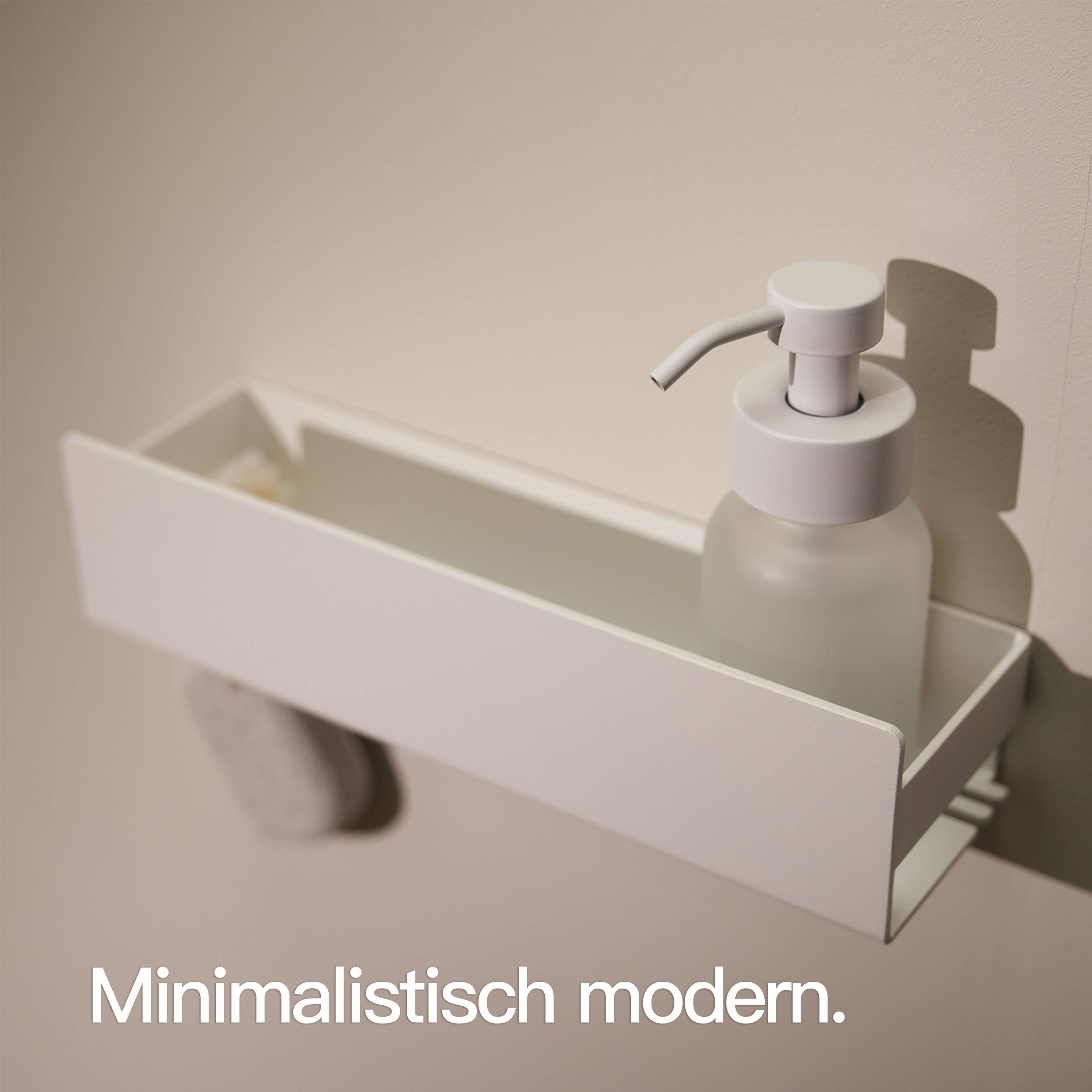
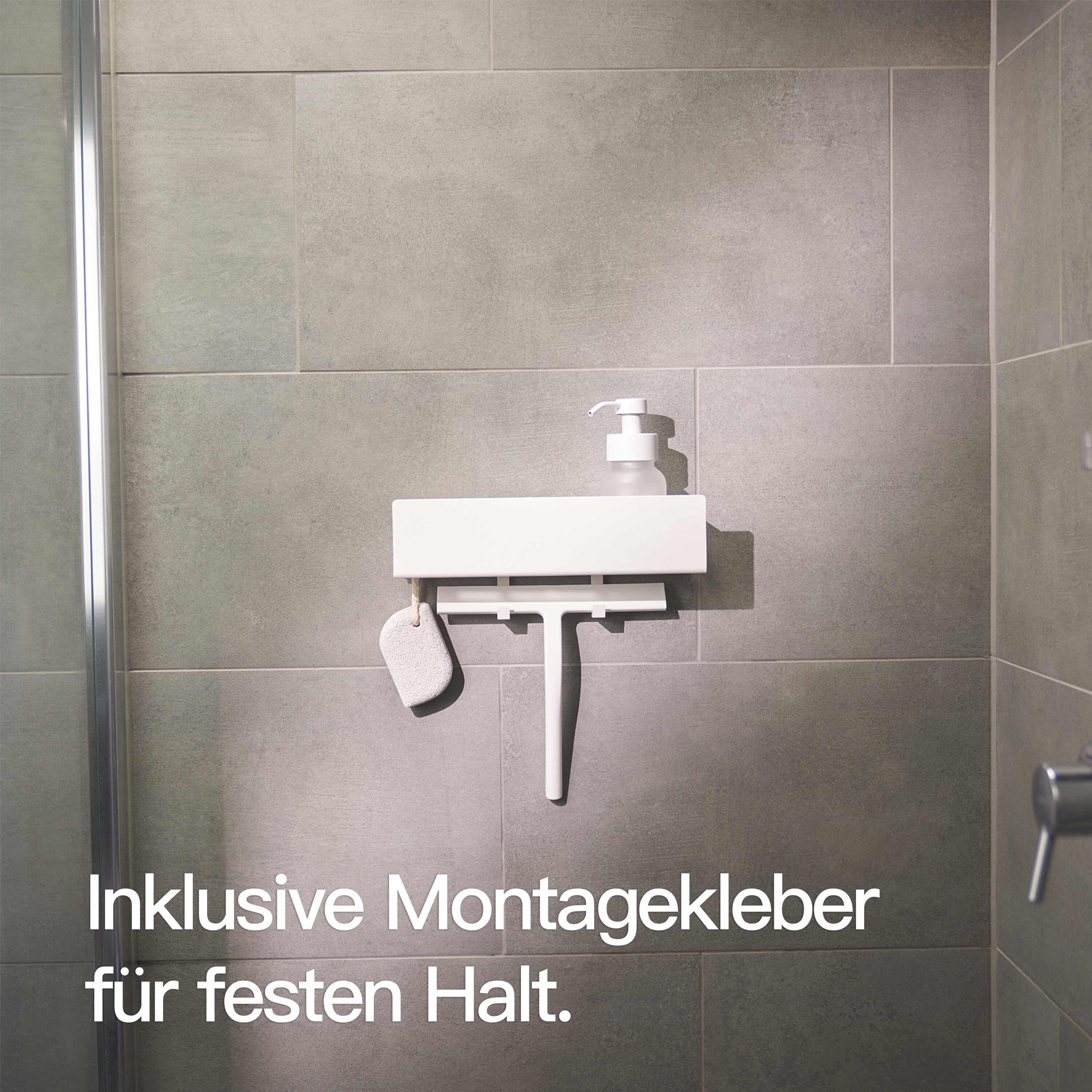
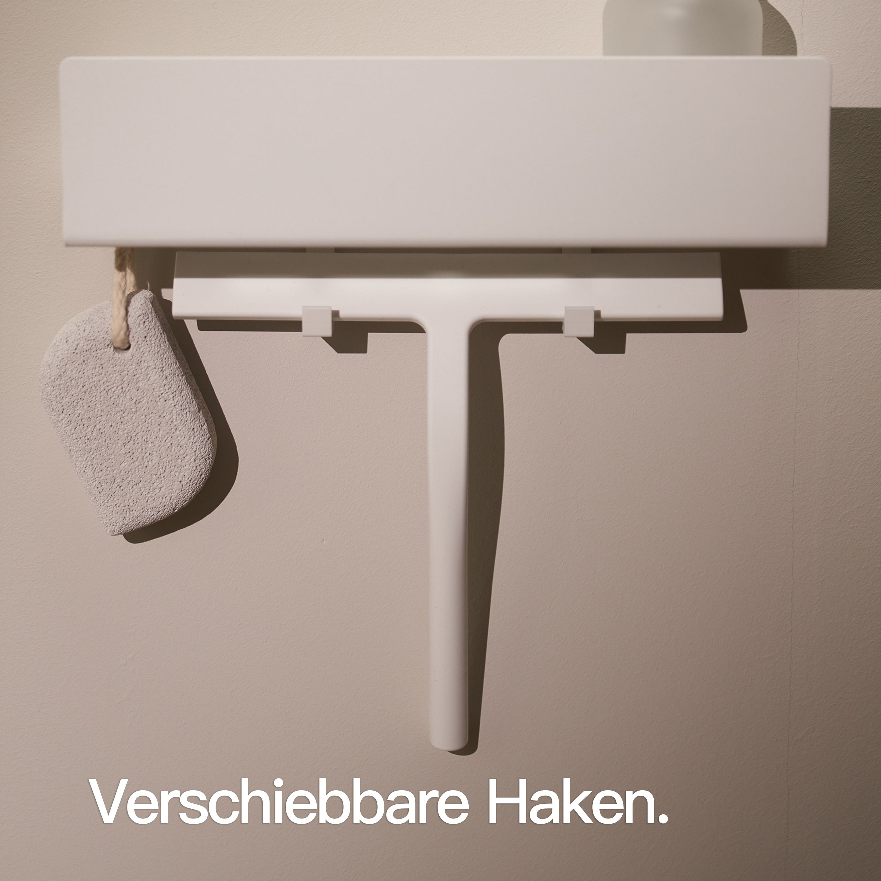
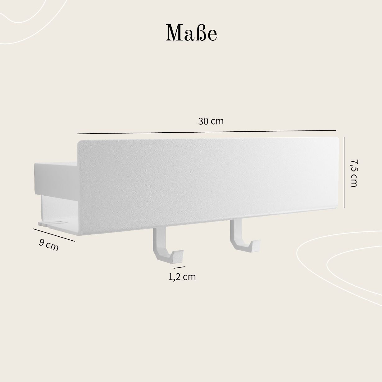
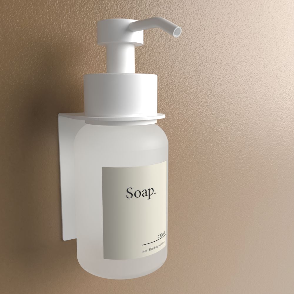
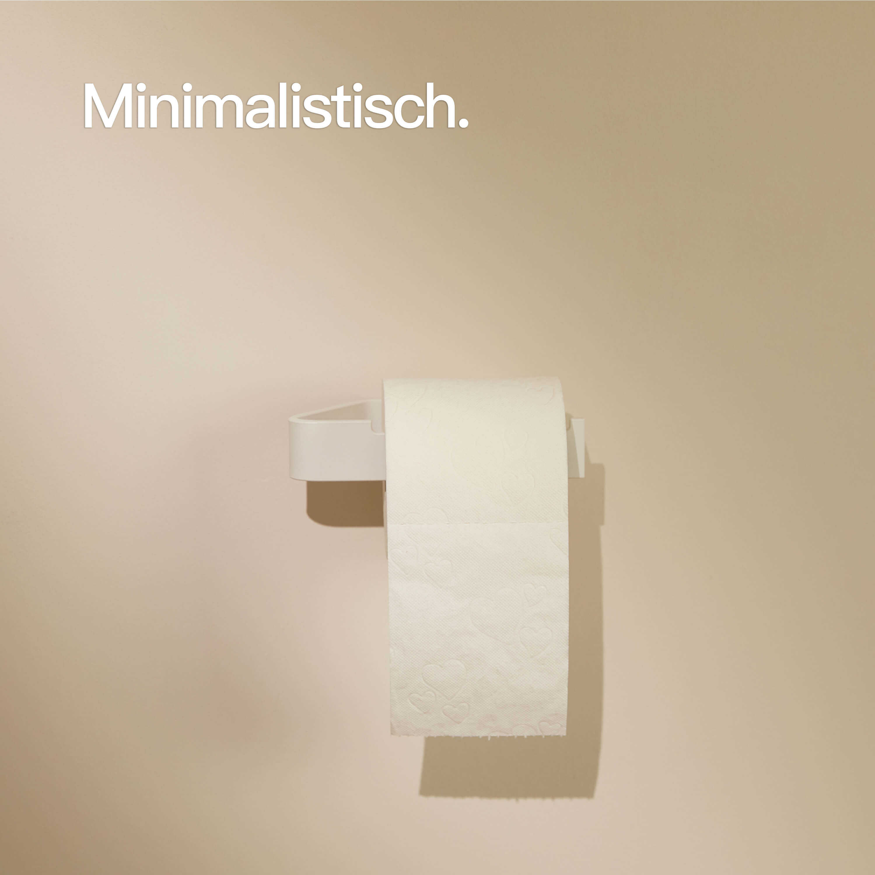
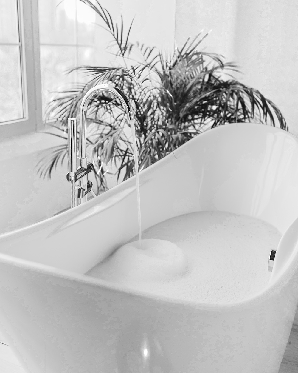
Summer Refresh in the Bathroom: Small Updates Without Drilling
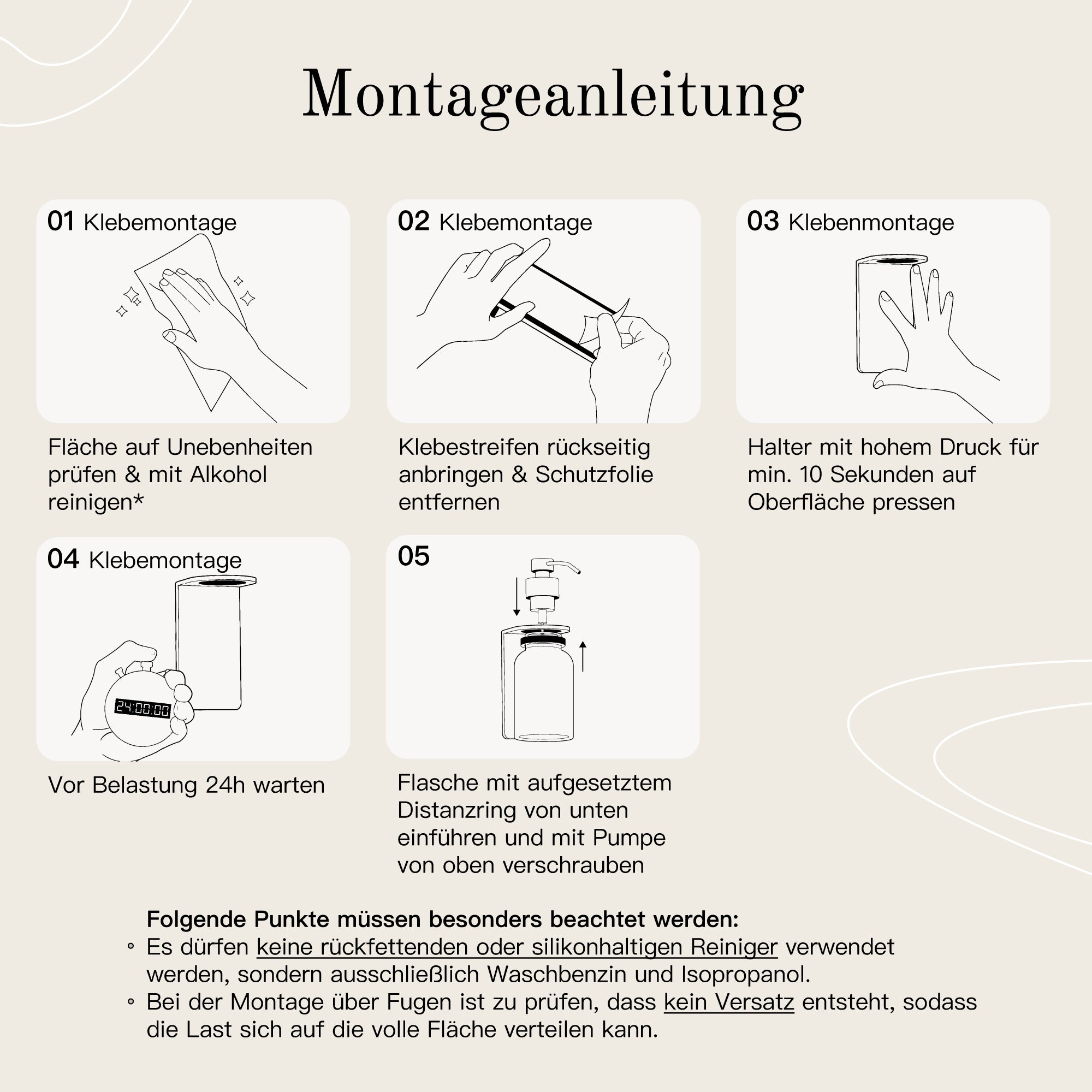
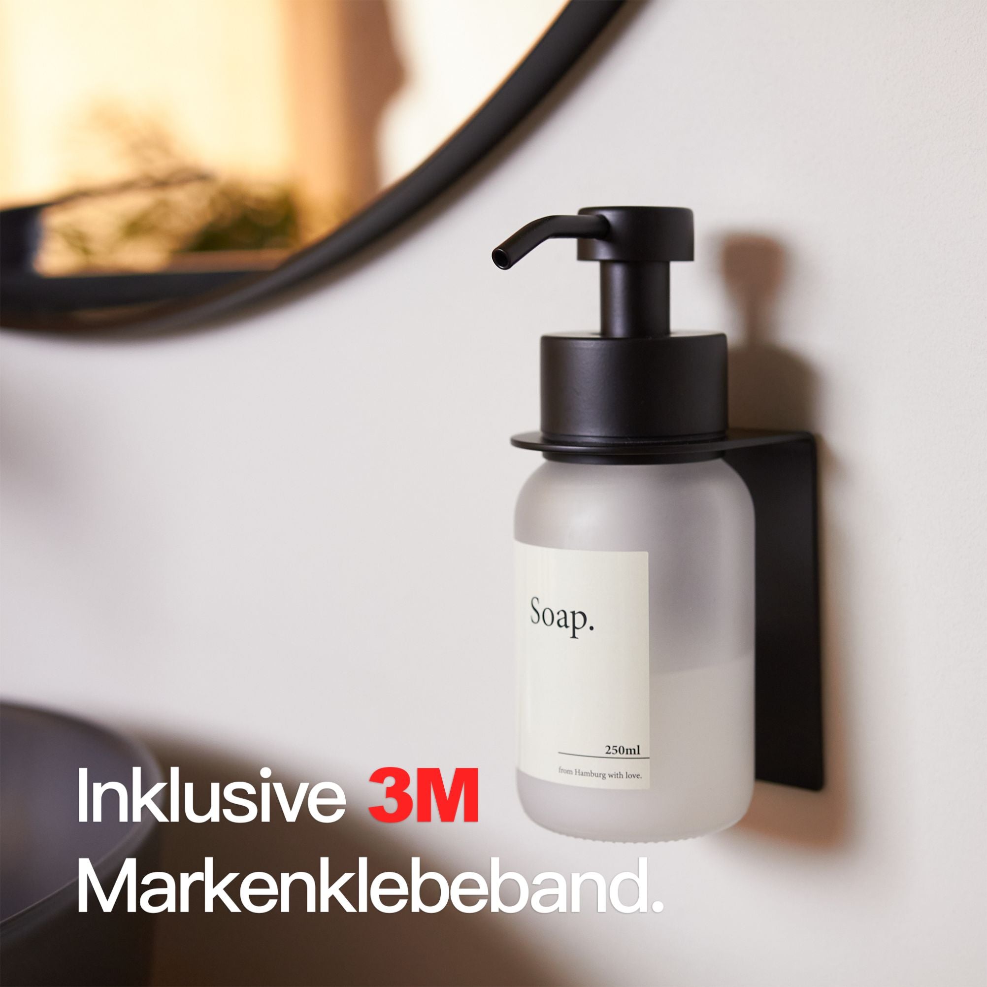
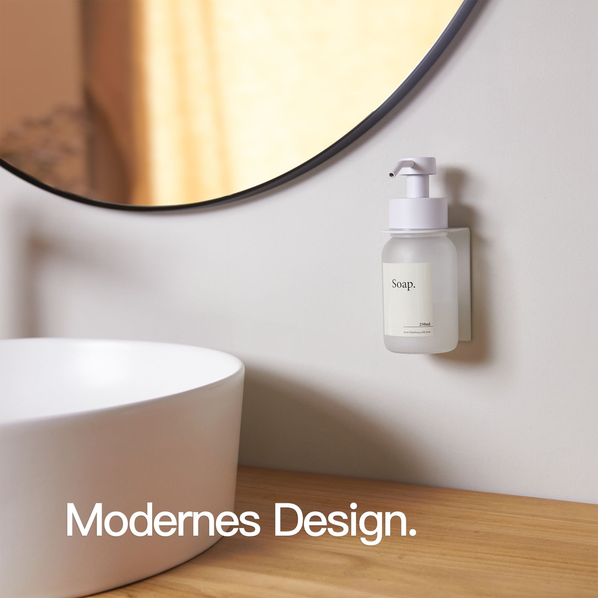
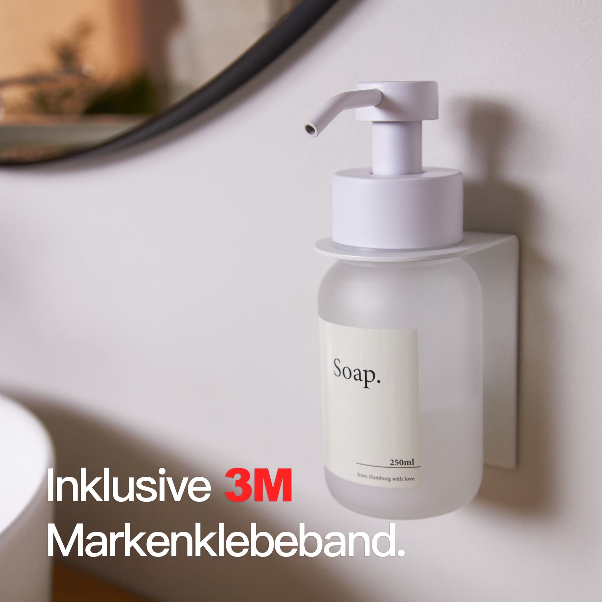
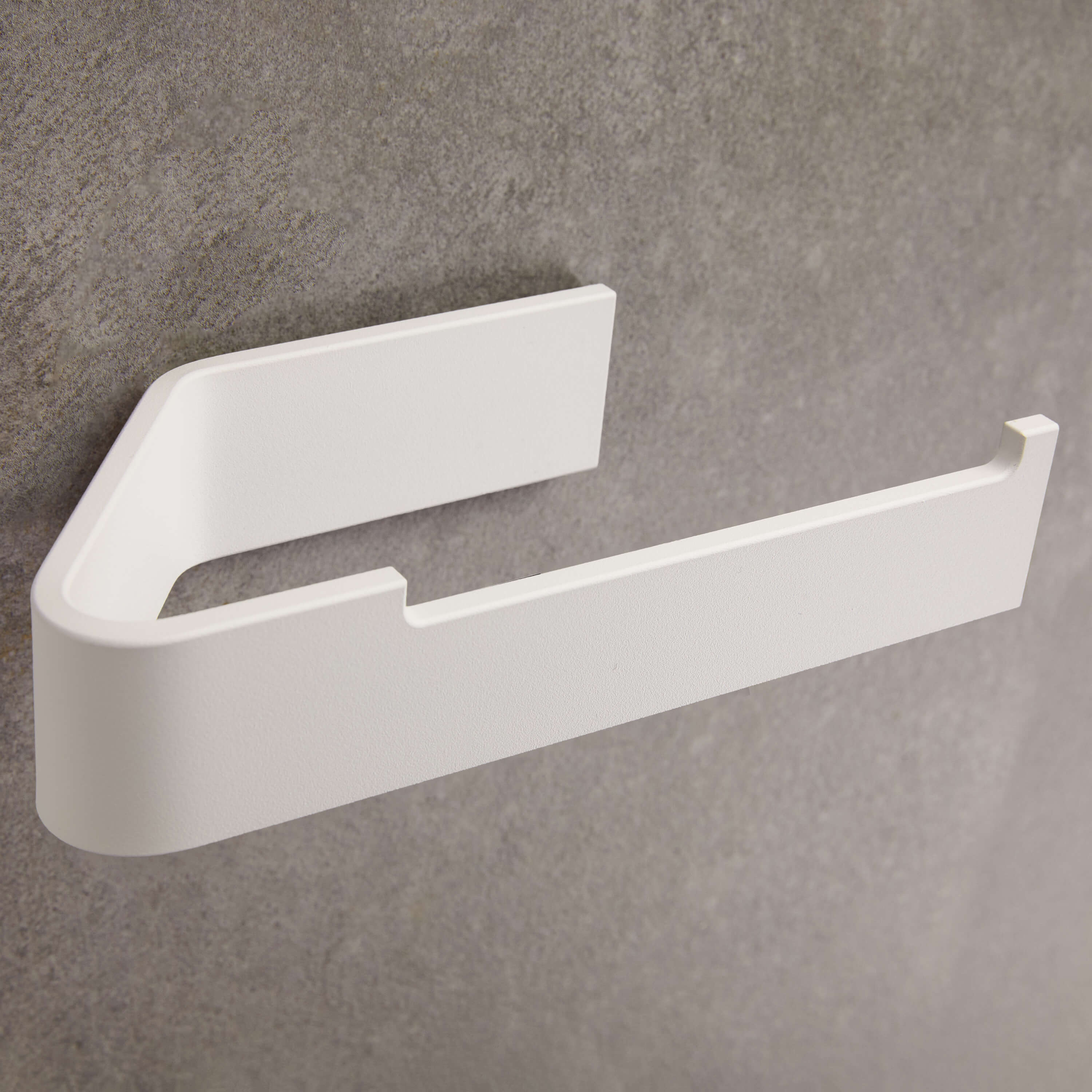
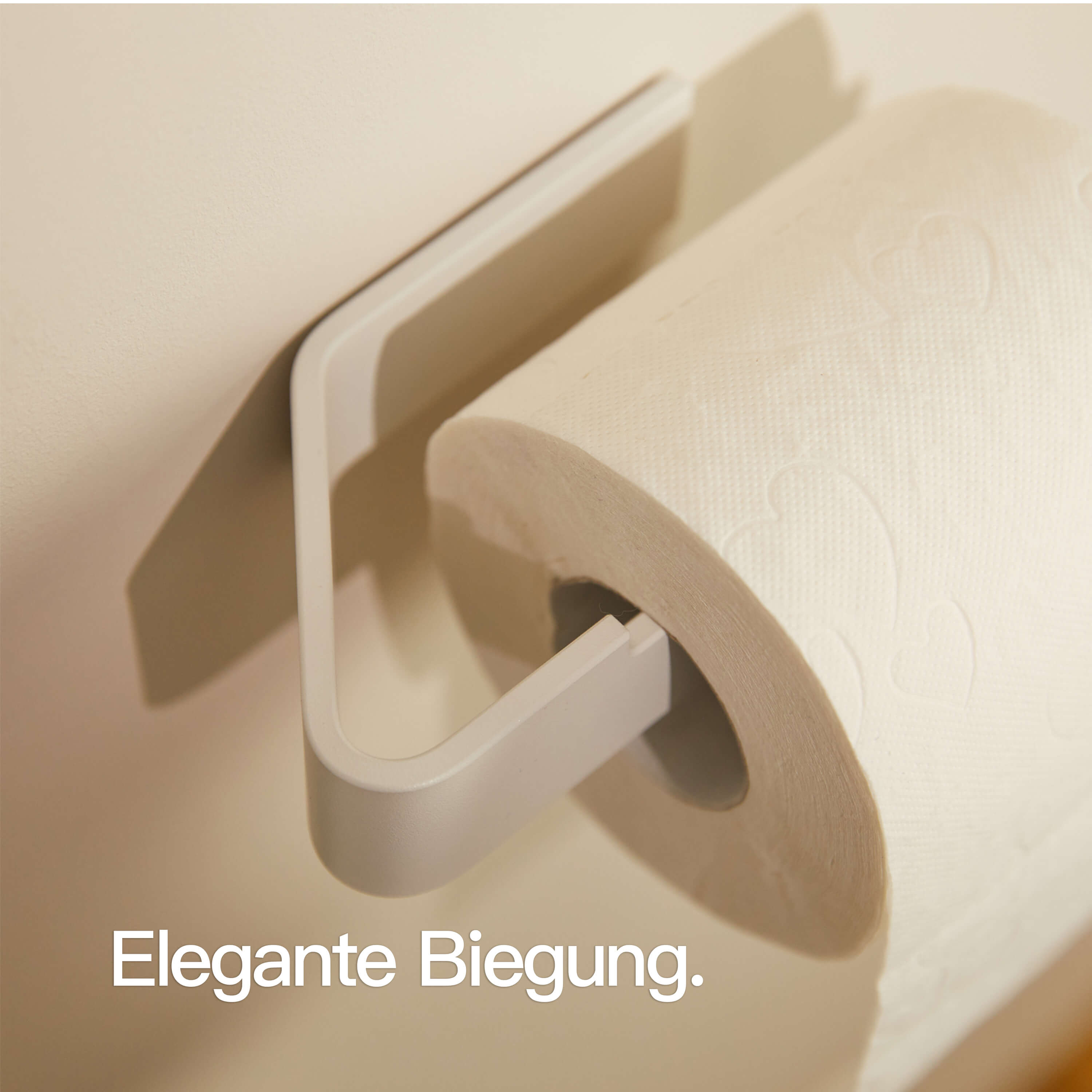
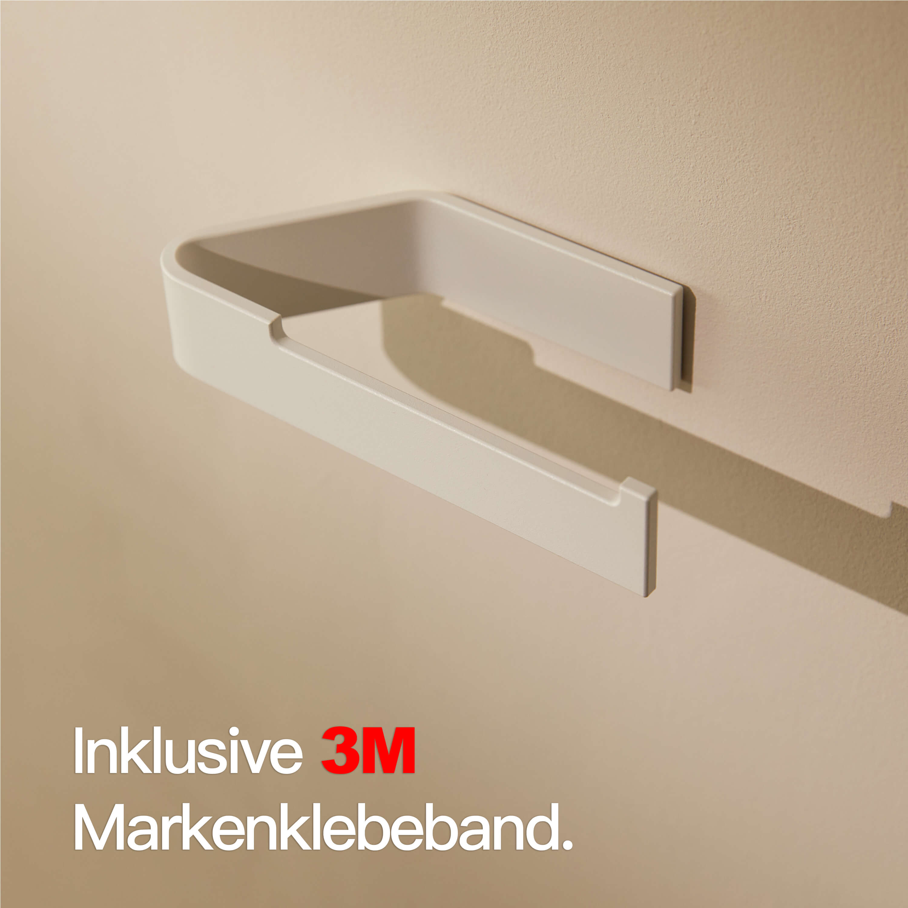
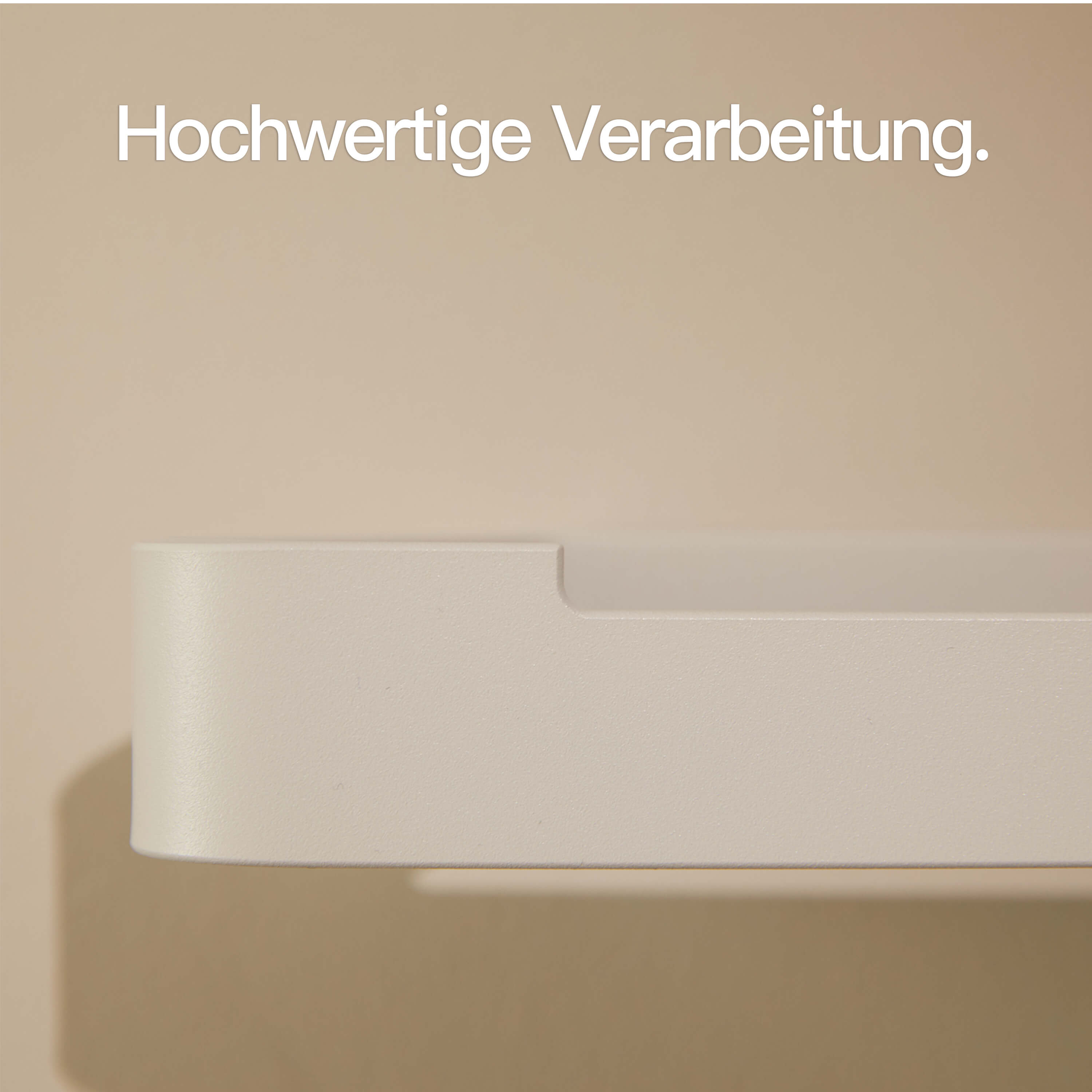
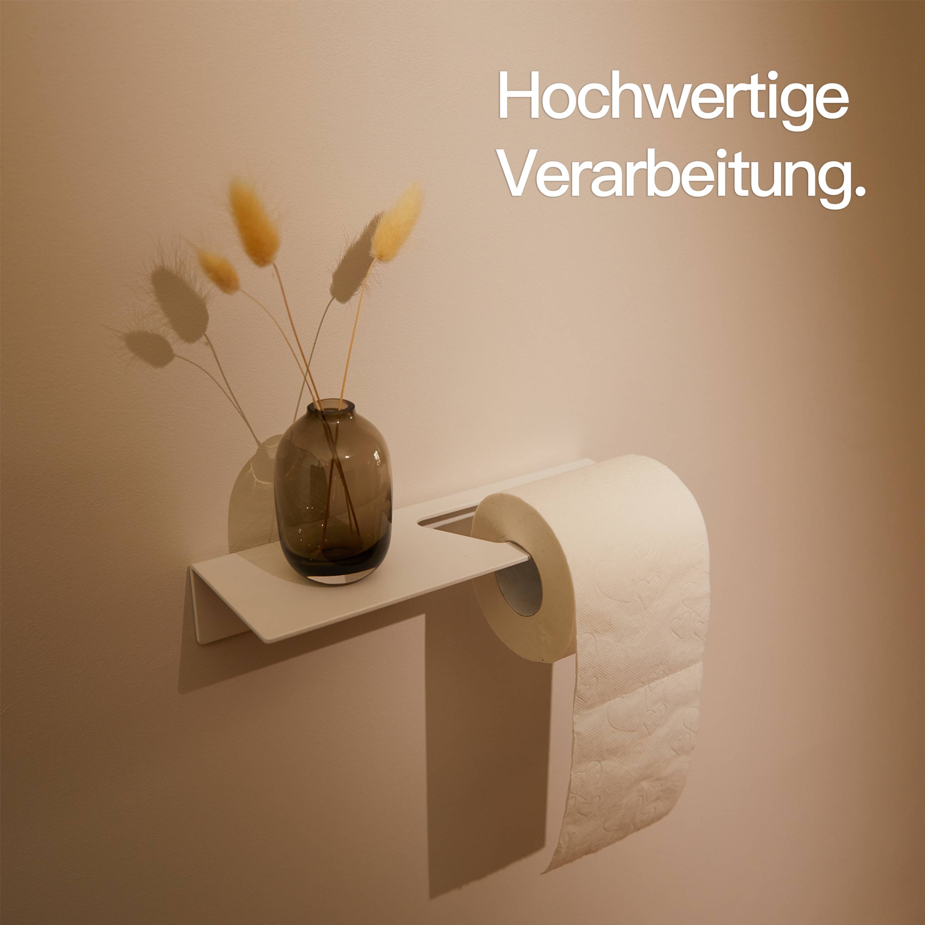
Summer in the bathroom doesn't start only with new tiles or a major renovation. Often, small, well-chosen updates are enough to make your bathroom feel lighter, tidier, and fresher. Especially practical: many modern bathroom accessories can be installed without drilling. This way, you add more style and function to your bathroom without the hassle of tools, dust, or holes in the tiles.

Color Trends 2026: How to Bring Fresh Style into Your Home
Discover the color trends of 2026 and learn how to stylishly incorporate natural tones, contrasts, and metal accessories into your bathroom, kitchen, and hallway.


Better sleep: How to make your bedroom quieter
Good sleep depends not only on the mattress, temperature, or blackout. The mood in the room also plays a big role. If your bedroom feels calm, tidy, and light, you can often relax better. This is exactly where the furnishings make a difference. Especially the area next to the bed is often underestimated, even though it directly affects your daily routine every evening and every morning.